Get to know analytics
Last updated: September, 2026
About analytics
Circle analytics empowers you to stop guessing and make data-driven decisions that foster a thriving community. It goes beyond basic metrics, giving you a comprehensive view of revenue, event engagement, device usage, members, and much more, all consolidated into easy-to-understand dashboards.
Here’s how analytics unlocks valuable insights:
See the bigger picture: Gain a complete understanding of when, where, and how your members like to engage within your community, including their device preferences and usage statistics.
Identify engagement drivers: Understand which tactics resonate most with your members and which types of content drive the highest engagement. This allows you to focus your efforts on what truly matters.
Discover top events: Identify the most popular and well-attended events. Use this data to plan future events and ensure maximum engagement.
Track financial health: View all your revenue metrics from Circle Paywalls in one place to gain an understanding of your community’s financial health.
Optimize engagement timings: Discover the ideal day and time when your members are most active. This allows you to tailor your communication strategy for maximum reach and impact.
Customize data grouping: Adjust how graph and chart data are visually grouped to compare and analyze activity across different time periods. This flexibility empowers you to identify trends and make data-driven decisions with ease.
Availability
Analytics is available on all community plans. However, for graphs and charts within dashboards, data can only be grouped by week on the Professional and Business plans (see the data grouping section below).
Advanced analytics features, such as filters and data grouping options (specifically daily and monthly), are available to communities on the Scale and Circle Plus plans.
Access analytics dashboards
Admins can access analytics dashboards through the desktop app as well as on web and mobile browsers.
To access the analytics, click Analytics in the left sidebar, then select Overview. In the Analytics menu, you can navigate to the following dashboards:
How Member Activity Tracking Works
We track and report on member activity to give you accurate analytics that reflect real usage across your community.
Active members (including DAUs & MAUs): We use real-time, client-side tracking to measure when a member actually visits and engages with your community. This gives a more reliable count than backend API requests alone, which can overcount members active in multiple communities or receiving background updates.
Time spent: We track, in real time, how long members actively spend in your community, segmented by device.
Device analytics: You can see activity breakdown across web, iOS, and Android devices, helping you understand how members engage within your community.
ℹ️ Note: If you're comparing analytics from before and after August 2025, you may notice a shift in metrics, typically lower active member counts and time spent. This is most common for communities where members belong to multiple communities or primarily use mobile apps. The updated figures better reflect actual usage.
Viewing data
While exploring data within various dashboards, you can utilize the following options to maximize your insights.
Data explanation
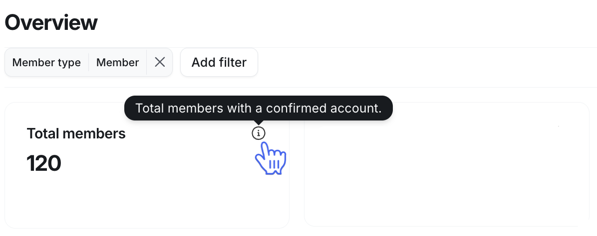
You can access helpful information about the graphs, charts, and other metrics, including formulas used to assign scores, by hovering over the ℹ️ icon.
Member type filter
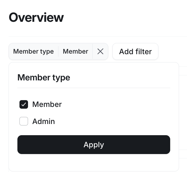
Member type filter is available on all community plans. By default, all data in analytics dashboards displays only member-related information, including member and moderator roles.
However, if you want to include admins in the analytics, you can adjust the Member type filter located at the top of any analytics dashboard.
ℹ️ Note: Within analytics, we show data based on members who have completed the onboarding and set up profiles for their community accounts.
If you have sent invitations to people who have yet to finish their onboarding and create their account profiles, you can view their count in the Invitation pending metric in the overview dashboard.
Filters
Data filtering allows you to narrow down the data using various criteria such as member tags, spaces, members’ join dates, profile fields, and more.
Filters are available to communities on the Business, Scale, and Circle Plus plans.
Filters help you:
-
View analytics data for specific groups.
For example, track how members with specific member tags engage within your community, the popular devices among them, the ideal times when they are most active, and much more. This helps you plan content for specific member groups within your community.
-
Track engagement throughout a member’s lifecycle.
For instance, see how members who joined in the last 30 days are engaging within the community or specific spaces. Check out how the join date affects member activity and engagement.
-
Understand how members interact within specific spaces.
For example, filter data for the “Help & Support” space to see how often members post questions and what the most common ones are.
-
Analyze member interactions from specific locations.
Utilize the location profile field to filter member activity by location to see how members from different locations engage within your community, ideal times when they are most active, etc.
The following filters are available in analytics, depending on the type of dashboard:
Member tags
Join date
Last logged in
Profile fields, including the custom fields
Spaces
Space groups
To use a filter in any dashboard:
-
Click the Add filter option in the filter selection bar at the top and choose from the list.
-
Once you select a filter, enter your desired criteria or select one of the options. Depending on the filter type, you can also leverage advanced conditional rules.
For text-based profile fields, you can use contains, does not contain, is, and is not.
-
For date-based filters, you can use less than, equals to, and greater than.
Click Apply to activate the filter.
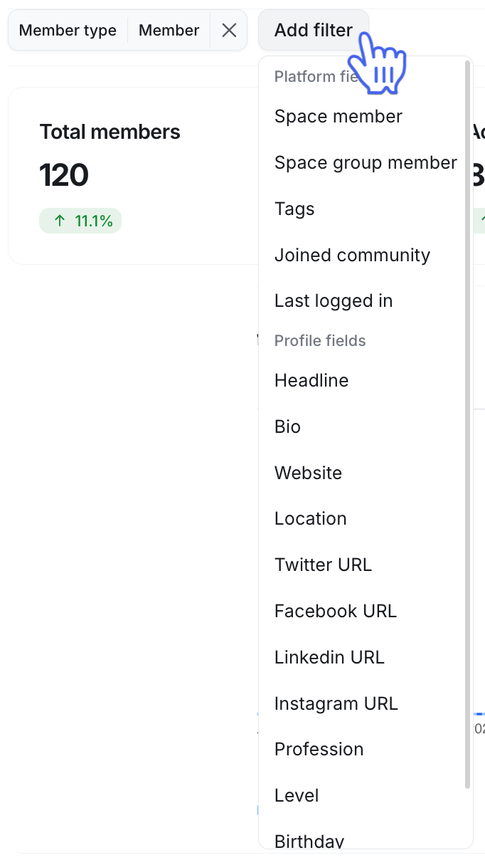
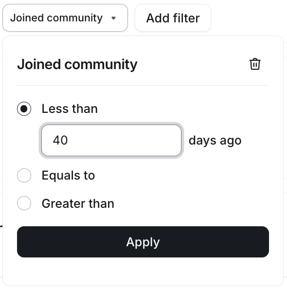
Once you’ve added a filter, it will remain applied across all dashboards where it is available. However, if you navigate away from the analytics section to any other area in your community, the filters will be reset.
To remove filters:
Click the filter you want to remove.
In the top-right corner of the filter menu, click the 🗑️ icon.
Data grouping
The data grouping option allows you to analyze trends within graphs in your analytics dashboards (excluding the overview dashboard) over different time intervals, such as daily, weekly, and monthly.
Data grouping helps you:
Customize your bar and line charts to your preferred interval within the selected date range.
Identify daily, weekly, and monthly trends to help you spot patterns.
Understand how your efforts are paying off over different cycles.
By default, all community plans provide access to graphs grouped in weekly intervals. However, on the Scale and Circle Plus plans, you can also choose daily and monthly grouping options.
To change the data grouping option, click the current selection in the top-right corner of the dashboard and select your preferred option.
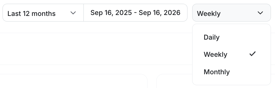
The data grouping option will remain applied across all dashboards for graphs. When you navigate away from the analytics section to any other area in your community, it will be reset to weekly grouping.
Date range
You can select a predefined date range or set a custom date range to filter data within your preferred time frame. Modifying the date range will affect all dashboards in analytics, except the overview dashboard.
To select a preset date range, click the dropdown icon next to the current range selection and choose an option. There are several preset options available, including the last 7 days, 4 weeks, 3 months, 12 months, and month-to-date, quarter-to-date, and year-to-date.
Alternatively, you can define a custom range by clicking the current date range and selecting new start and end dates.
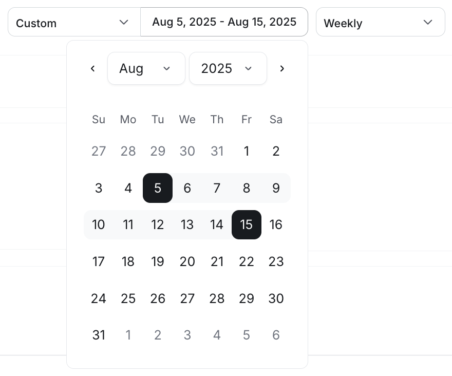
When you navigate away from the analytics section to another area of your community, it will reset to the last 3 months.
Previous period comparison
Previous period comparison helps you understand how your community’s analytics are trending over time by comparing current metrics against historical performance. This gives you immediate context for spikes or dips, making it easier to tell whether changes reflect meaningful movement or normal fluctuation.
Comparison appears directly on the metric, showing how the current period compares to the previous one. For Popular day & time and Member distribution by country, hover over the heatmap or country to view the comparison details.
How comparisons work depends on which dashboard you're viewing.
Overview dashboard
The overview dashboard uses fixed comparison periods based on the chart type. Supported charts automatically display comparisons, such as rolling 30-day or 90-day views, or year-over-year monthly comparisons. Metrics that are total or all-time views do not include comparisons.
All other dashboards
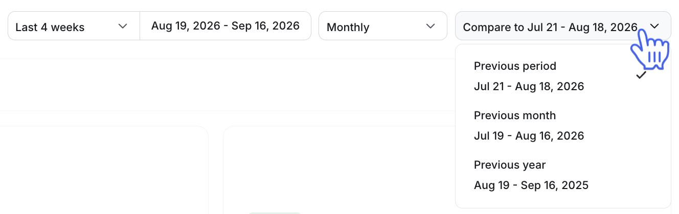
On all other dashboards, you can select a historical period to compare your data against. To compare your data, click the comparison period dropdown and select from the following options:
Previous period: Compares to the time period directly before your selected date range. If you select January 8 - February 5 (4 weeks), this option will compare the data to December 10 - January 7 (4 weeks).
Previous month: The same date range from the month before. If you select January 1 - January 14, this option will compare the data to December 1 - December 14.
-
Previous year: The same date range from the year before. If you select January 1 - January 31, this option will compare the data to January 1 - January 31 from the previous year.
Sort columns
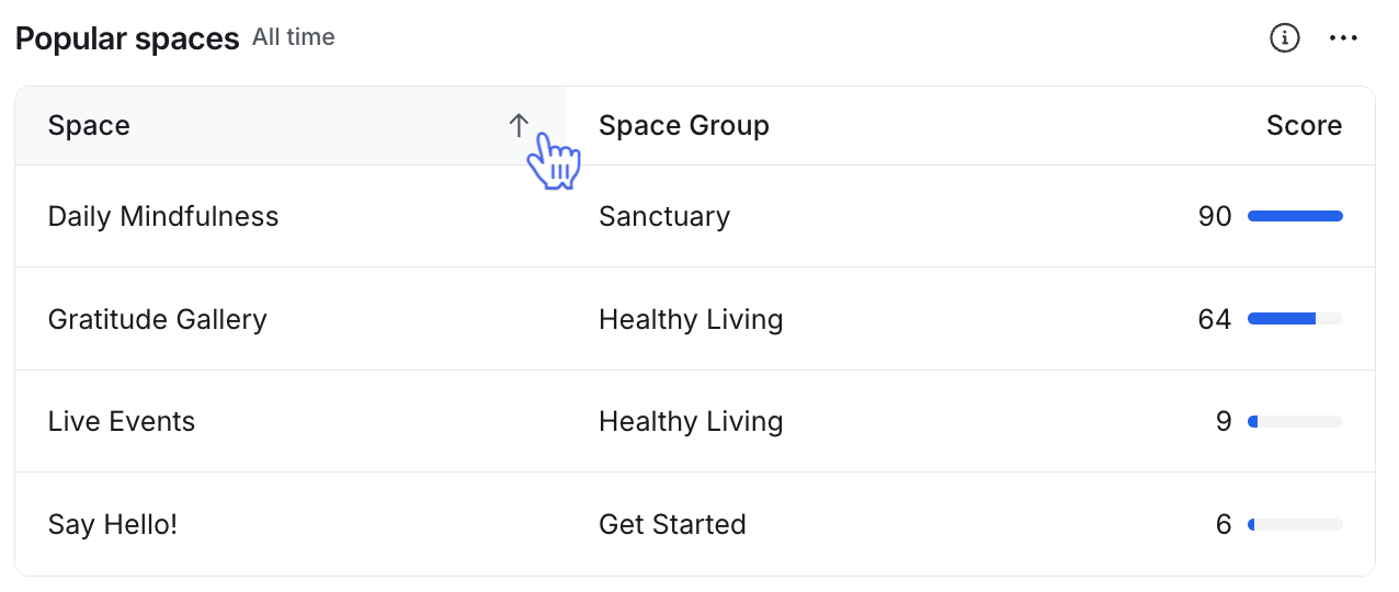
When reviewing information within leaderboards and the heat map, you can easily sort data by clicking the column titles. This allows you to arrange data from lowest to highest scores or alphabetically.
Data timezone
When analyzing time-related data, it will be displayed in the timezone specified in your community account settings. For example, if two admins are in different locations, they will see data based on their respective account time zones.
Data updates
Data within analytics is near real-time. However, please note that certain data, such as posts, comments, and messages from new community members or in new spaces, as well as active member graphs, may be delayed by a few hours before being fully updated.
ℹ️ Note: We display historical data to show information on posts, comments, and messages based on the snapshot approach. This means that if a space had 15 posts on a specific day, it would always show as 15, even if some or all of those posts are deleted in the future.
Downloading data results
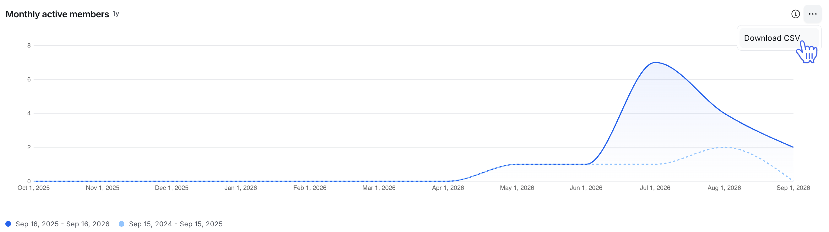
When viewing graphs, tables, and other metrics within analytics dashboards, you have the option to download these results as a CSV.
ℹ️ Note: Results provided will only account for the information displayed in the dashboard. Any underlying calculations or data, such as member information, will not be included in these results.
To download results:
-
Hover over the graph, table, or metric, click More actions (three dots) in the right corner, and select Download CSV.
The file will be downloaded directly to your device.