Setting up a lock screen
Last updated: September, 2026
Create captivating locked pages that elevate the visual appeal of your community’s private spaces. This article will walk you through the steps to configure lock screens within your community.
About lock screens
Lock screens help you create stunning locked pages for your community spaces that are set to private. Lock screens are supported on all types of spaces in the community to tease your community content with enticing banners, media-rich descriptions, and compelling call-to-action.
Once a lock screen is configured for a private space, it becomes visible to the following users in your community:
Private community: Non-members of the space.
Public community: Community visitors and non-members of the space.
You can now set up two types of lock screens, depending on how and where someone tries to access a private space:
Lock screen pages: Build your own pricing or sales page and select it as the landing page for non-space members on web browsers and the Circle desktop app.
Mobile lock screen: Set up a lock screen for private spaces on mobile apps. Configure a banner, description, and call-to-action button that links to a custom URL, such as a paywall or sign-up form.
Here are some impactful strategies to leverage lock screens for your private spaces:
Engaging teasers: Build a page using hero headers, feature highlights, and testimonials to showcase what members love about the space. A well-placed testimonial adds social proof and helps build trust with potential members, especially when paired with a compelling preview of what they’ll unlock inside.
Promote paywalls: Build a landing page with pricing blocks to promote your community memberships and redirect non-space members or visitors (if the community is public) to a paywall checkout page where they can purchase a membership in order to gain access to the paywalled space.
Custom URLs for access: Tailor the lock screen to redirect users to a custom URL based on your specific use case. For instance, you can add a registration form URL or URL to your website where they can fill out the form and request access. Once you approve it, you can add them to the private space.
Set up a lock screen page (web and desktop)
If you haven’t built a landing page yet, start by creating one using Website builder. Once it’s ready, follow the steps below to select it as the landing for any private space viewed on web browsers or the Circle desktop app.
📚 Learn more about creating pages here.
To set up a lock screen page:
Click Community in the left sidebar, then select Spaces.
Hover over the space name and click More actions (three dots) and select Edit space.
In the Customize tab, set your page visibility to Private under the Access section.
-
Click the dropdown under Lock screen page and select the page you want to display as the landing page
To browse or create a new landing page, click Manage all pages to quickly navigate to the Pages section.
ℹ️ Note: The landing page must be published and set to Open to appear in the list of available lock screen pages.
Click Save changes.
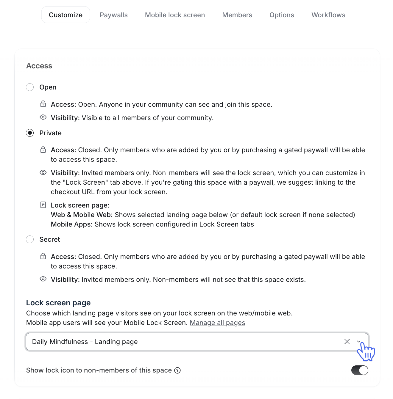
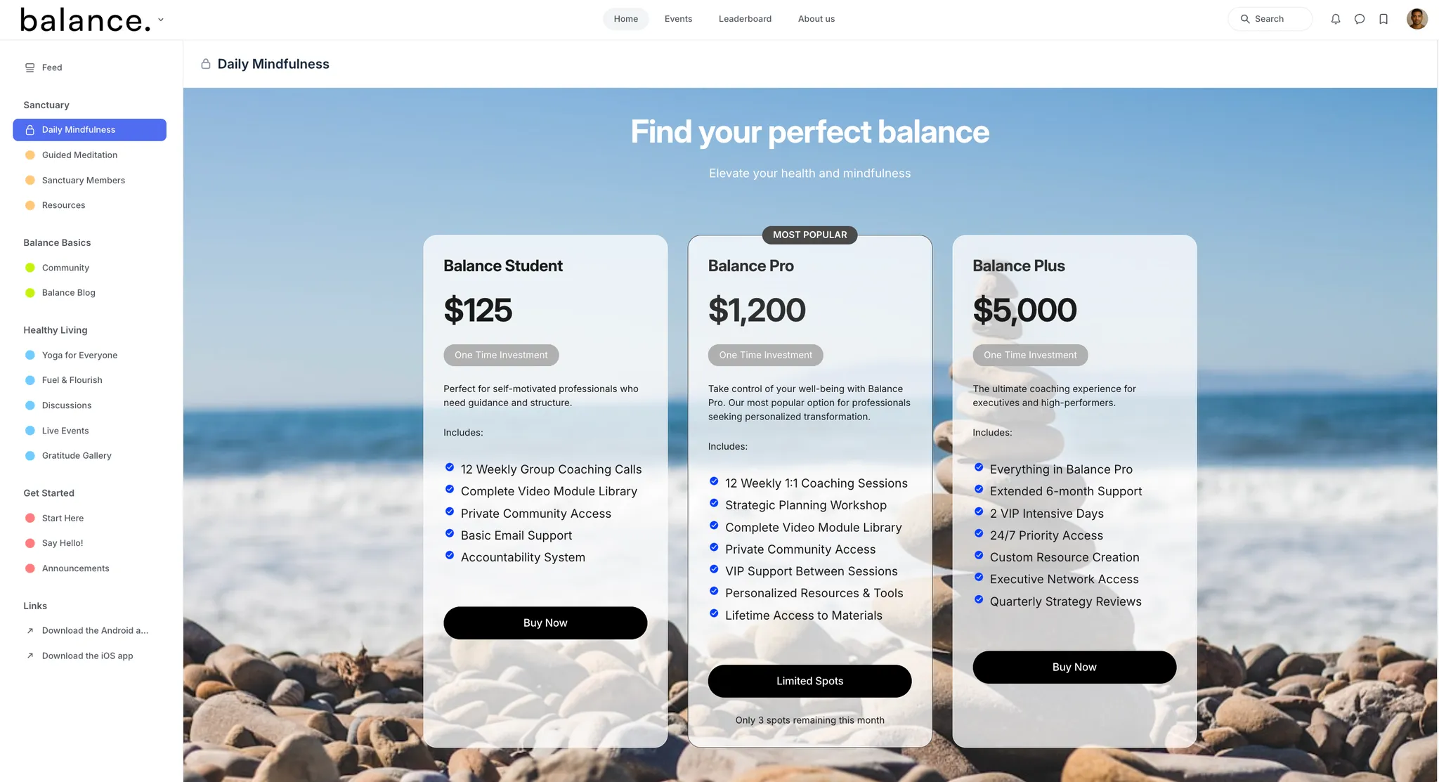
❗️Important: If you do not select a Lock screen page under the Customize section, the mobile lock screen will be used as the default landing page.
Set up a mobile lock screen (mobile apps)
To get started:
Click Community in the left sidebar, then select Spaces.
Hover over the space name and click More actions (three dots) and select Edit space.
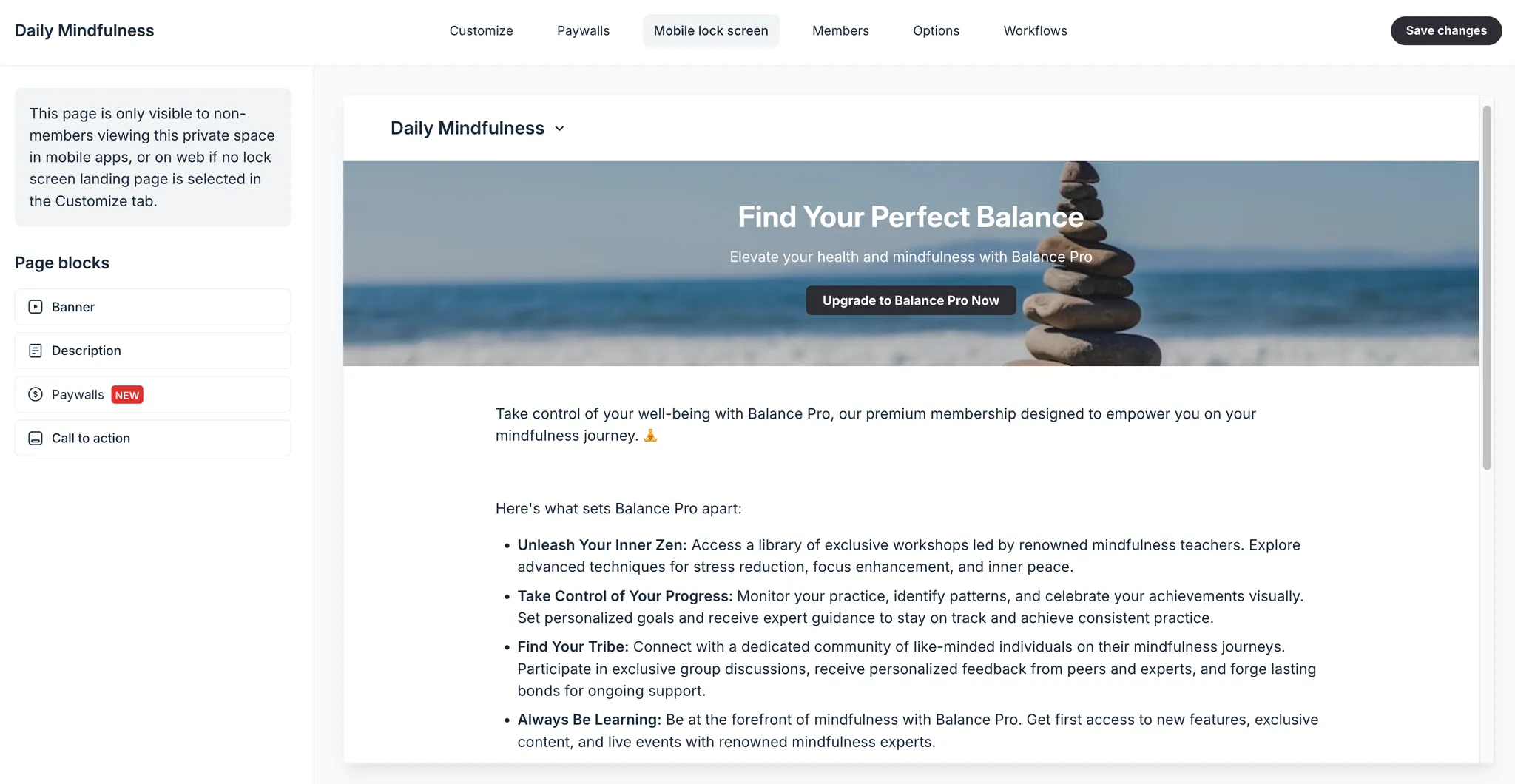
Navigate to the Mobile lock screen tab.
Customize page blocks
The mobile lock screen is composed of the following blocks, allowing you to customize it with various elements:
Banner
Description
Lessons (available only on course spaces)
Paywalls
Call to action
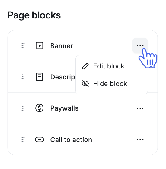
To customize a page block, click More actions (three dots) next to it and click the Edit block.
Banner and call to action
Both banner and call-to-action blocks share the same options for content and design. In these blocks, you can add a stunning background, a heading, a short description, and a CTA button.
Follow the steps below to add content and customize the design of these blocks.
Go to the Content tab to set up the following:
Heading: Add a headline for your lock screen block.
Description: Provide a concise description that complements the headline.
Button label (optional): Assign a label to the button, such as Buy now, Subscribe, or Join now.
-
Button link: If you have added a button label, add a button URL that redirects members to your preferred location. This button URL can be of any webpage, including:
Custom URL: If you are using a third-party subscription platform or want your prospect members to request access by visiting your website, you can add the relevant URL in this field.
Email URL: You can also include an email link using the mailto:[your email address] format for visitors and non-space members to request access by contacting you.
Paywall checkout URL: In addition to the paywalls page block, you can also add one of the paywall checkout URLs to the button link field.
In the Design tab, you can set up the following:
-
Background image: Add an image from the Unsplash library or add your custom image using the Upload option.
ℹ️ Note: 📷 Recommended image dimensions: 1840 x 460px.
Customize element color: Get creative with your lock screen elements by adding custom colors to the overlay, heading, text, button background and button label.
Description
Make the most of the description block to provide a glimpse of the content within the private space and detail what non-space members will receive upon gaining access. If this space is behind a paywall, you can also consider including an additional description of membership privileges.
Text composition and formatting options
To access basic text composition and formatting options, type the forward-slash (/) command and choose from the menu:
Paragraph: Create standard text blocks for your content.
H2 and H3 headings: Use different heading styles to structure your text effectively.
Numbered and bulleted lists: Organize information within the description using lists.
Blockquote: Highlight and emphasize specific text with a distinct block quote style.
Divider: Add a horizontal divider to separate different sections of your content. Dividers improve visual flow, making your description easier to scan and visually organizing different topics within it.
Code: Use the code option to format technical content or programming snippets. Please note that while code blocks are excellent for sharing code snippets with readers, they're not designed to include custom scripts or interactive code on your lock screen.
Emoji: Incorporate emojis to add personality and expression to your content.
ℹ️ Note: Instead of plain text, you can use Code to share code snippets with your members in a more appropriate format. Please note that code blocks are not intended to be used to add custom code snippets to your mobile lock screen.
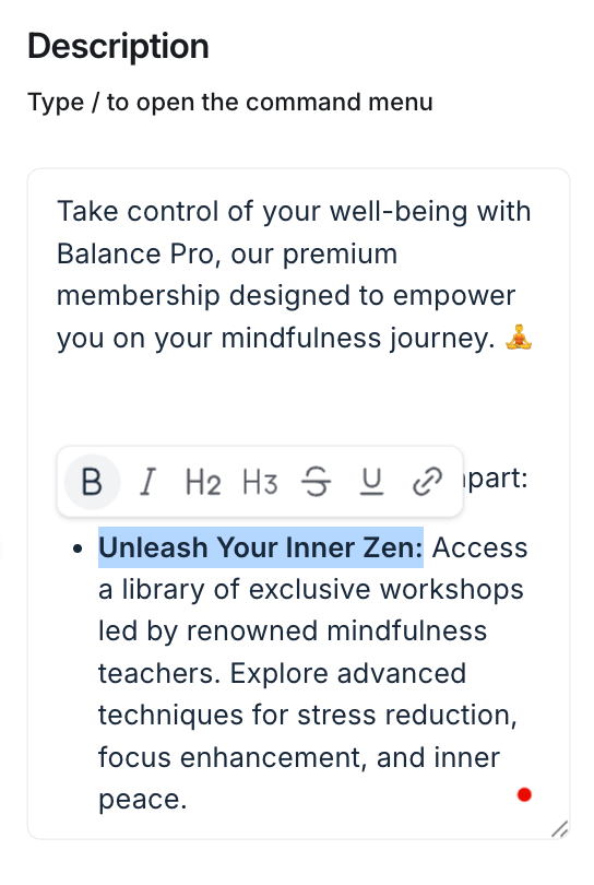
To edit written text in the editor, highlight the text to reveal a formatting bar with options such as:
Bold: Emphasize important words or phrases by making them bold.
Italic: Use italics to add subtle emphasis, such as for quotes, titles, or unique terms.
H2 and H3 headings: Apply H2 or H3 headings within highlighted text to create structured sub-sections in your content.
Strikethrough: Cross out text using the strikethrough option to show edits or corrections.
Underline: Underline text to add emphasis or highlight particular points.
Hyperlink: Turn highlighted text into a clickable link by adding a URL. Hyperlinks are ideal for referencing additional resources and related content or directing readers to specific pages within or outside your community platform.
Link community content
Within the description, you can link to various community content, such as posts, spaces, events, and lessons. This is especially useful for boosting engagement and driving traffic back to key areas or content within your community.
To link community content, type the Hashtag # followed by the content title, such as the space name. As you type, suggestions will pop up. Then select the content you want to link from the results.
Incorporate rich media content
For rich media content, you can type the forward-slash (/) command to add:
Images: Upload, embed, or choose an image from the Unsplash library. Compatible with JPG, PNG, or GIF files.
File and PDF: Share various file types or PDF documents as attachments within your text.
Audio: Upload MP3, WAV, and OGG format audio files.
-
Video: Upload video files in formats such as MP4 or MOV or embed a video URL.
You can customize your uploaded video with options such as adding chapters, enabling transcriptions, and controlling download permissions. Hover over the video player, click the Customize video (setup icon) located in the top-right corner to access these options. For detailed steps, see Guide to video customizations.
Giphy: Include GIFs directly from Giphy.
Embeds: You can embed rich media directly in a lock screen's description block. This is a great way to showcase videos, images, or interactive content from supported platforms—helping you create a more engaging and informative experience for non-space members. For more information about embeds, see Guide to embedding media in your community.
Add buttons
Buttons are an effective way to create clear, actionable calls to action on your mobile lock screen. They visually stand out and guide users to key resources or webpages, such as your website, specific community area, sign-up forms, or other key links. The buttons you add to the mobile lock screen are visible in the Circle mobile app, ensuring your members can engage with these calls to action seamlessly on any device.
Follow these steps to add a button to your lock screen description:
Type the forward-slash (/) command in the editor and select Button from the menu.
-
In the button editor, enter the following details:
Enter the button label–this is the text that appears on the button (e.g., "Learn More”).
Add the URL or link where the button should direct members when clicked.
Customize the button color to match your branding. You can either enter the desired HEX code or click the current color to open the palette and choose a color visually.
Click Save to add the button.
Adjust button alignment
You can control how your button is aligned within the lock screen to optimize its visual impact:
Align the button left, center, or right.
Make the button more prominent by centering it with an extended-width display.
To adjust the alignment, hover over the button and click the icon corresponding to the alignment style at the top right of the button.
Edit or delete buttons
To modify or remove a button, hover over it. Then, select the edit or delete icon at the top right of the button to make your adjustments.
Lessons
When configuring a mobile lock screen for your course space, you can include the lessons block to showcase your course curriculum.
Please note that the lessons block displays only the published course curriculum. Ensure your lessons are published so they are visible in this section.
Paywalls
If you've set up Circle paywalls in your community, you can prominently showcase them on the lock screen of a private space. The paywalls page block allows you to display all the paywall options that provide access to the space, improving conversion by clearly highlighting your membership offerings.
ℹ️ Note: The paywalls page block is only visible when the mobile lock screen is used as the default lock screen for web browsers and the Circle desktop app. The paywalls block will not be visible on mobile apps.
Follow these steps to add a paywall in the block:
Select the paywall: Click the Select paywall dropdown menu. All the paywalls that provide access to this space will be listed here. Select one of the available paywalls from the list.
Choose the default price: Choose the default price you'd like to showcase on the paywall card. This price will be pre-selected when the member is directed to the checkout page.
You can add up to six paywalls to the lock screen. To add another paywall from the list, click ➕ Add paywall and repeat the above steps. Based on the above setup, you will now see a preview of the paywall cards on the lock screen.
After adding paywalls, you have several options for how they appear on the lock screen. These options include:
Highlight paywall price: You can feature a specific paywall to make it stand out on the lock screen. To do so, click More actions (three dots) next to the paywall and select Highlight price. A featured banner will be added to the top of the paywall card, making it more prominent.
Rearrange paywalls: If you've added multiple paywalls, you can control their order. Click the More actions (three dots) icon next to the paywall and select the Move up or Move down option to adjust the display order.
Delete paywalls: If you no longer want a paywall to appear on the lock screen, you can remove it. Click More actions (three dots) next to the paywall and select Delete.
💡 Tip: To directly access the paywall settings and either create new paywalls or manage existing ones, click the More actions (three dots) icon next to the Paywalls block title and select the relevant option.
Once your lock screen is set up with the desired paywalls, both members and visitors (for public communities) will be able to engage with the paywall options. Here's what they'll see on each :
Paywall name and price: The name of the paywall, along with the featured price you selected, will be displayed at the top.
Description: A checkout description that you have added to your paywall setup, allowing users to understand what’s included or any special benefits of joining.
Join button: Each paywall card features a Join button at the bottom. When clicked, users will be directed to the paywall checkout page. If multiple pricing options are available for the paywall, they can select their preferred price on the checkout page before completing their purchase.
ℹ️ Note: When you remove access to a space from the paywall setup, the paywall card will automatically disappear from that space's lock screen. Similarly, if you remove a price from the paywall setup that is set as the default price on the lock screen, that price will be removed from the paywall card. In this case, the next available price in the list will automatically be selected as the new default price for the paywall.
Organize page blocks
You have the option to personalize the layout of the mobile lock screen by altering the order of the page blocks as per your preference.
To change the sequence of the blocks, simply hover over the block you want to move, click and hold it, and then drag and drop it to the desired location.
Control block visibility
While you can set up all page blocks, you have the freedom of deciding which page blocks appear on your lock screen. This feature is particularly useful when you need time to modify a block before displaying it.
To hide a page block, click More actions (three dots) next to it and click the Hide block. To make it visible again, hover over it and click the Show block.