Customize elements and blocks in the visual builder
Last updated: October, 2026
Customizing your email makes it look and feel like yours. Whether you are adding your content, adjusting text, adding images, or changing button styles, the visual builder gives you full control over both content and design.
How to access customization options
To start customizing:
Open the visual email builder in a broadcast or workflow.
-
In the center editor, hover over an element or block until you see a blue outline.
-
Click the element or block to select it. From here, you have two sets of options:
-
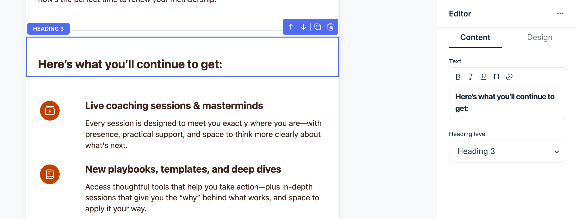
Edit content and design: The right sidebar opens with customization options. These include content such as texts, images, or links, and design options like colors, spacing, and borders. Depending on the element or block, these options may appear together or be grouped under separate Content and Design tabs.
-
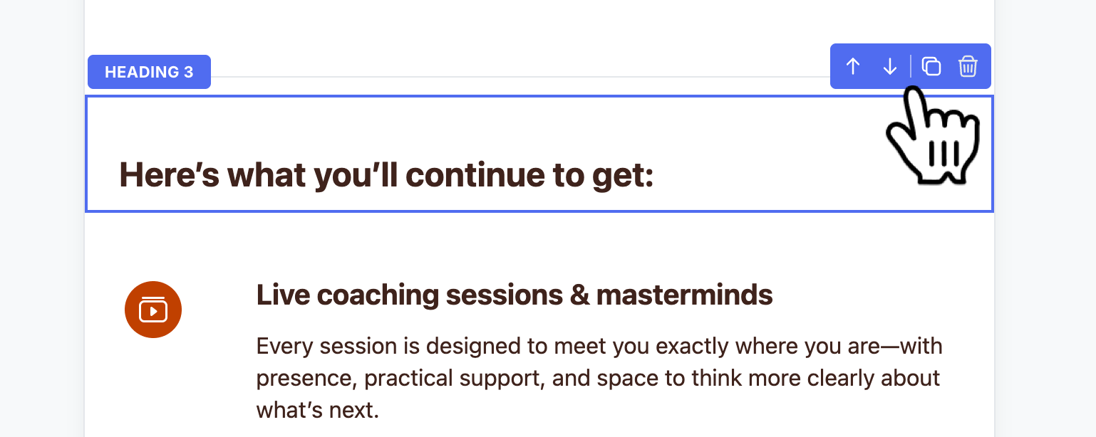
Reorganize, duplicate, or delete: A small control bar appears in the top-right corner of the element or block. Use the icons to move it up or down, duplicate it, or delete it.
-
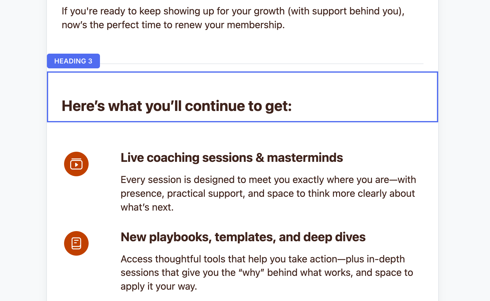
If you’re new to the visual builder, we recommend the following guides. They walk you through creating a broadcast, setting up an email action, getting familiar with the builder, and adding elements and blocks:
Customize the content of the elements
When you select an element, you can update its content from the right sidebar. The available options depend on the element and may include text, list items, images, or links.
Elements like buttons and paragraphs have their content options under the Content tab in the right sidebar.
Let’s take a look at how you can set content for different elements.
Text
For text-based elements such as paragraphs and headings, the Content tab provides a text field and styling options.
Add content
You can add and edit text in two ways:
Using the right sidebar: Enter your content directly into the text field in the Content tab.
-
Directly in the center editor: Click on the text or heading element within the main editor to type directly in place. Formatting keyboard shortcuts also work here, so you can adjust text style.
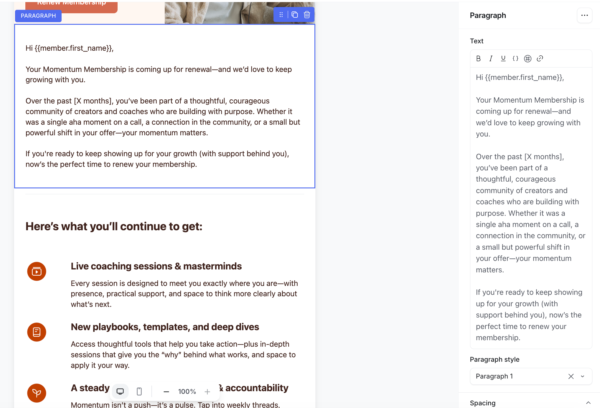
You can also:
Mention members by typing @ and selecting their name. This automatically links to their profile.
Link community content such as posts, spaces, or lessons by typing # and selecting from the list.
Add emojis
If you’d like to use emojis in your text, copy them from another source (like your computer’s emoji picker) and paste them into the text field or directly in the editor.
Add dynamic variables
Personalize your emails using dynamic variables, which automatically insert information for each recipient. For example, you can greet the recipients at the start of the email by adding a member name variable.
To insert a variable:
Type curly brackets {{ in the editor, or
Click the Add variable {} icon on the toolbar, then select a variable from the list.
You can utilize the following variables:
{{member.first_name}}
{{member.last_name}}
{{member.name}}
{{member.email}}
{{member.public_uid}}
{{community.name}}
{{community.url}}
Fallback value
You can also set a default value for variables in email broadcasts so messages read naturally when member data is missing. Add a fallback directly in the variable using | [fallback text] within the curly brackets.
For example, to set a default value for the member’s last name, write: {{member.first_name | student }}. If a member hasn’t added a first name to their profile, the email will show student instead of leaving it blank
When the email is sent, Circle checks whether each recipient has a value. If they do, Circle uses the member’s data. If not, it inserts the default value you provided.
Format text
Above the field, you’ll see a formatting toolbar with standard options like bold, italic, underline, and hyperlink.
To style specific words or phrases, highlight them and click the formatting icon you want. Keyboard shortcuts, such as Cmd/Ctrl + B for bold, also work here for quicker editing.
Choose text style
You can also choose the following style depending on the type of text element:
Paragraph: You can use a dropdown menu to switch between predefined paragraph styles. These styles give you a starting point for consistent formatting, but you can always fine-tune them further in the Design tab within the right sidebar.
Heading: You can choose from various heading level options using the dropdown as per your preference. As with paragraphs, you can further customize heading styles in the Design tab to match your brand.
Button
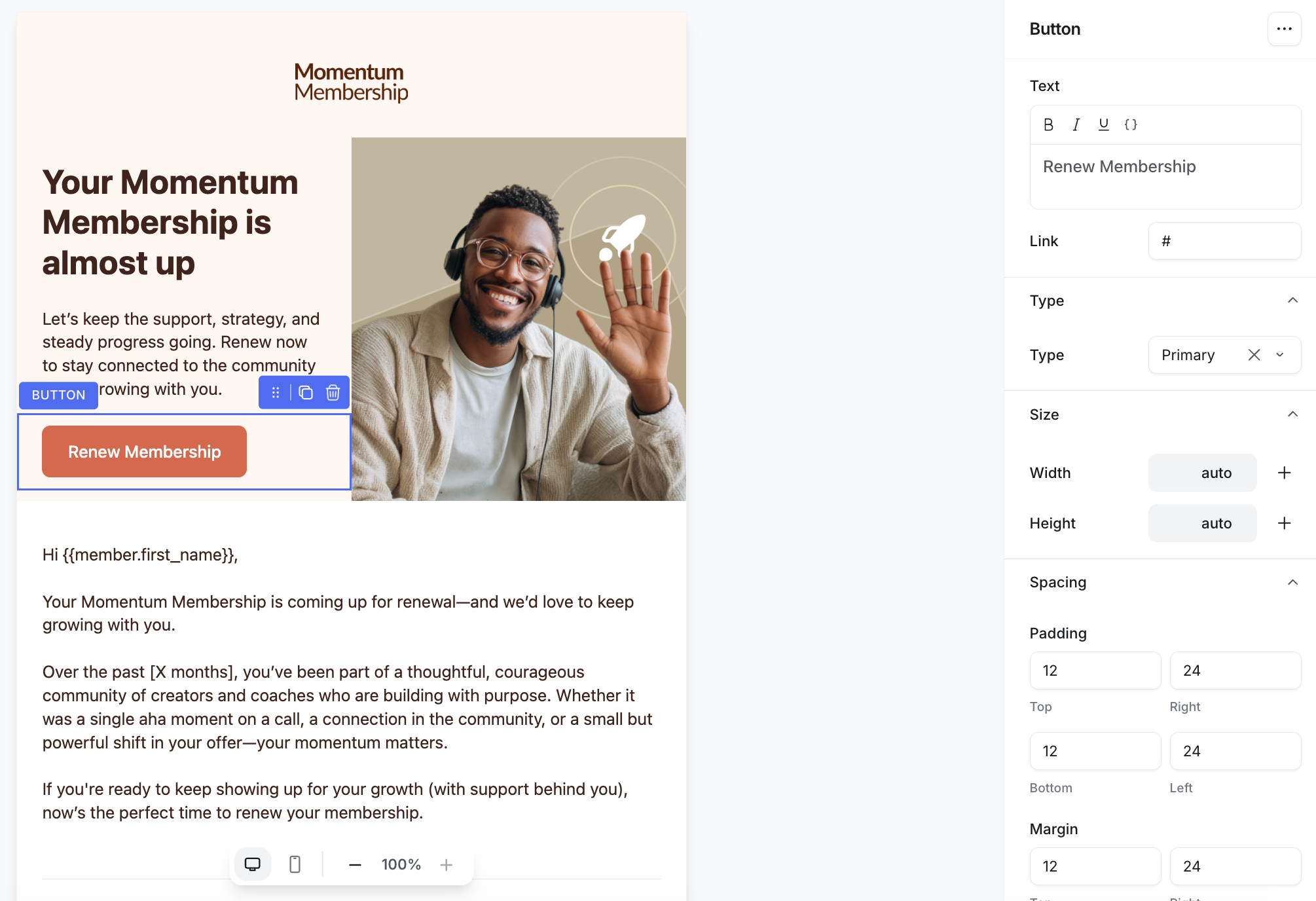
When you select a button element, the Content tab shows you two main fields.
-
Text: This is the label that appears on your button. Type your text directly in the field.
You can format the text using bold, italic, or underline options, and even insert dynamic variables using the Add variable {} icon above the field.
-
Link: Enter the destination link for your button. It’s important to enter the full, valid URL here, including https://, so the link works correctly in all email clients.
Link
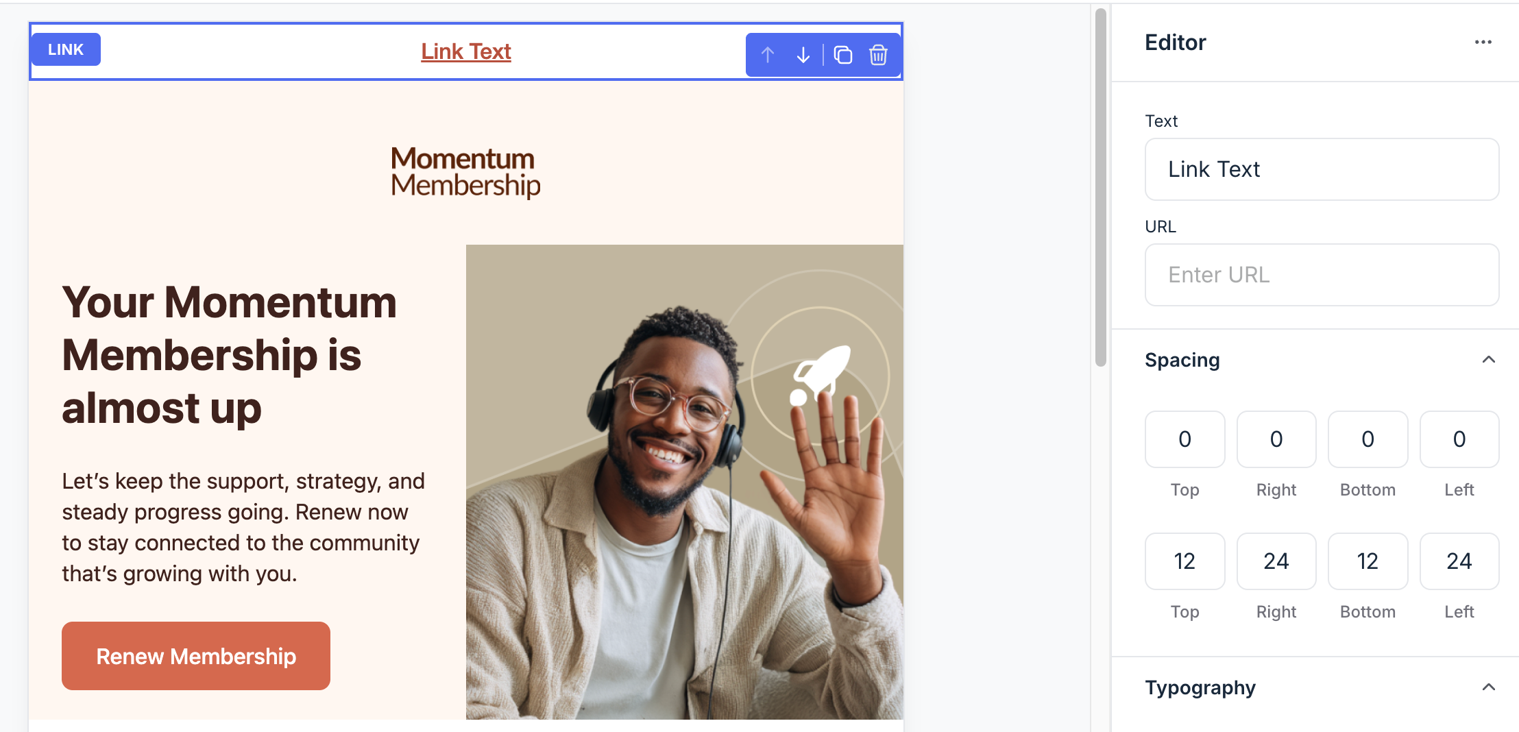
For link elements, you can set up the following in the right sidebar:
Link text: This is the text your readers will see in the email. Write something clear and actionable, for example, “Visit our website” or “Learn more”.
-
URL: Add the web address you want the link to point to. Always include the full URL with https:// to ensure the link works properly across all email clients.
Social links
Select the Social links element to configure it in the right sidebar.
URL: Paste the URL of your social platform in the respective link field.
Add link: Click the Add link button to add a new link to the block. Choose from Facebook, Instagram, X, YouTube, Spotify, TikTok, Pinterest, LinkedIn, Threads, Website and Email address.
Layout: Configure the link style, icon style, alignment and text or background colors.
Logo and image
For logo and image elements, you can add the following in the right sidebar:
-
Add an image: Click the placeholder thumbnail to open the image uploader. From here, you can:
Upload an image from your computer.
Browse and insert free images from the Unsplash library.
Paste a direct image URL to embed from the web.
Add alt text: Enter descriptive text for accessibility, which tells screen readers what the image shows.
-
Add a link: If you’d like the image to act as a clickable element, you can add a URL in the link field. When readers click the image, they’ll be taken to the page you’ve linked. This is a common way to make banners or product images in emails more interactive.
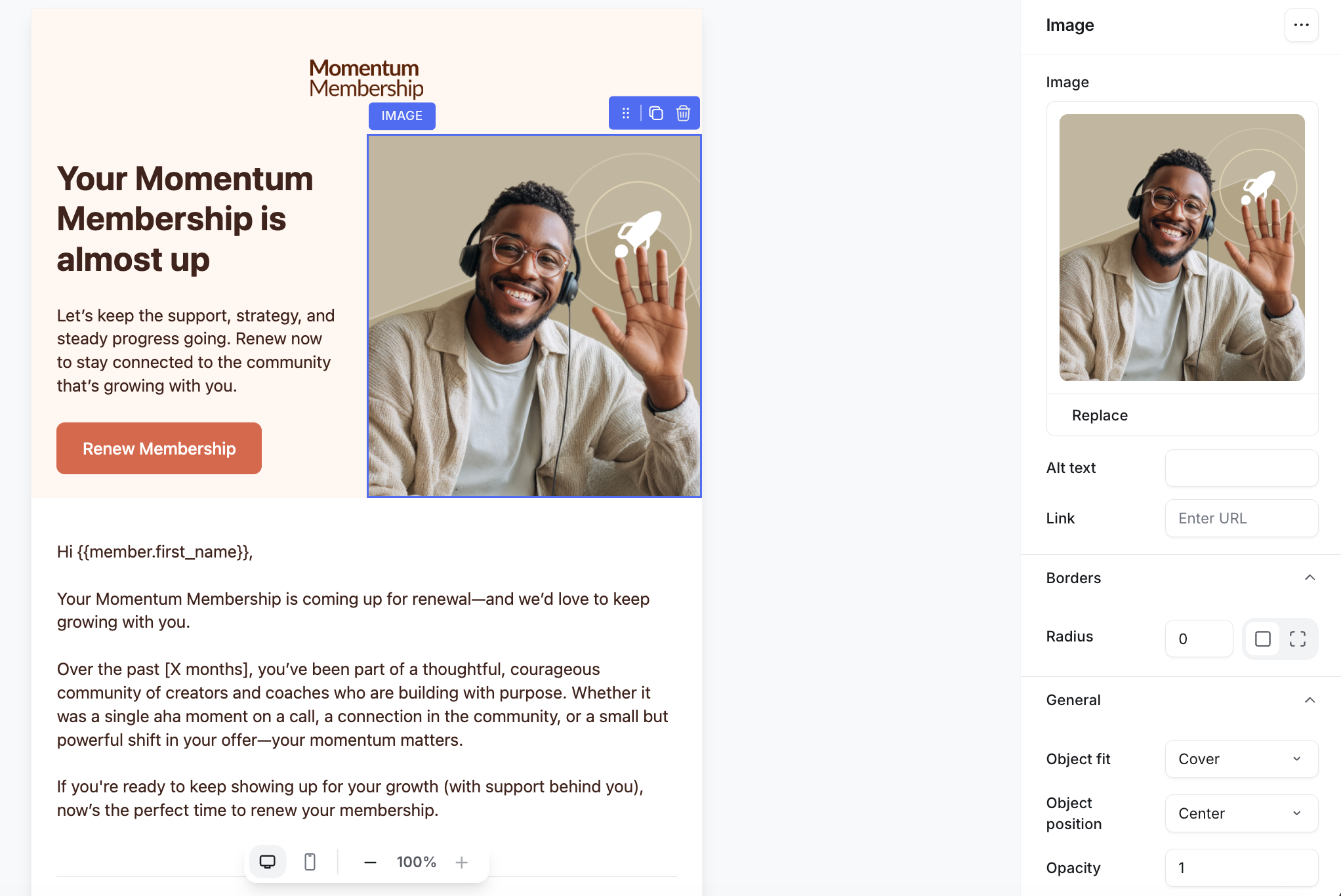
If you want to replace the image, select it from the editor and then click Replace or click the image thumbnail in the right sidebar.
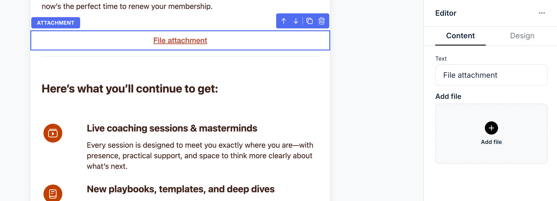
Attachment
For attachments, the Content tab provides the following options:
Text: Enter the label that will appear with your attachment such as, “Download guide” or “View price list”.
-
Add file: Click Add file, then choose a file from your device to upload. Once uploaded, the attachment will appear in your email as a downloadable link.
-
💡 Tip: Keep attachments small for faster email loading and to ensure they deliver correctly. If your file is large, consider uploading it elsewhere (like Google Drive or your community) and linking to it instead.
-
Video
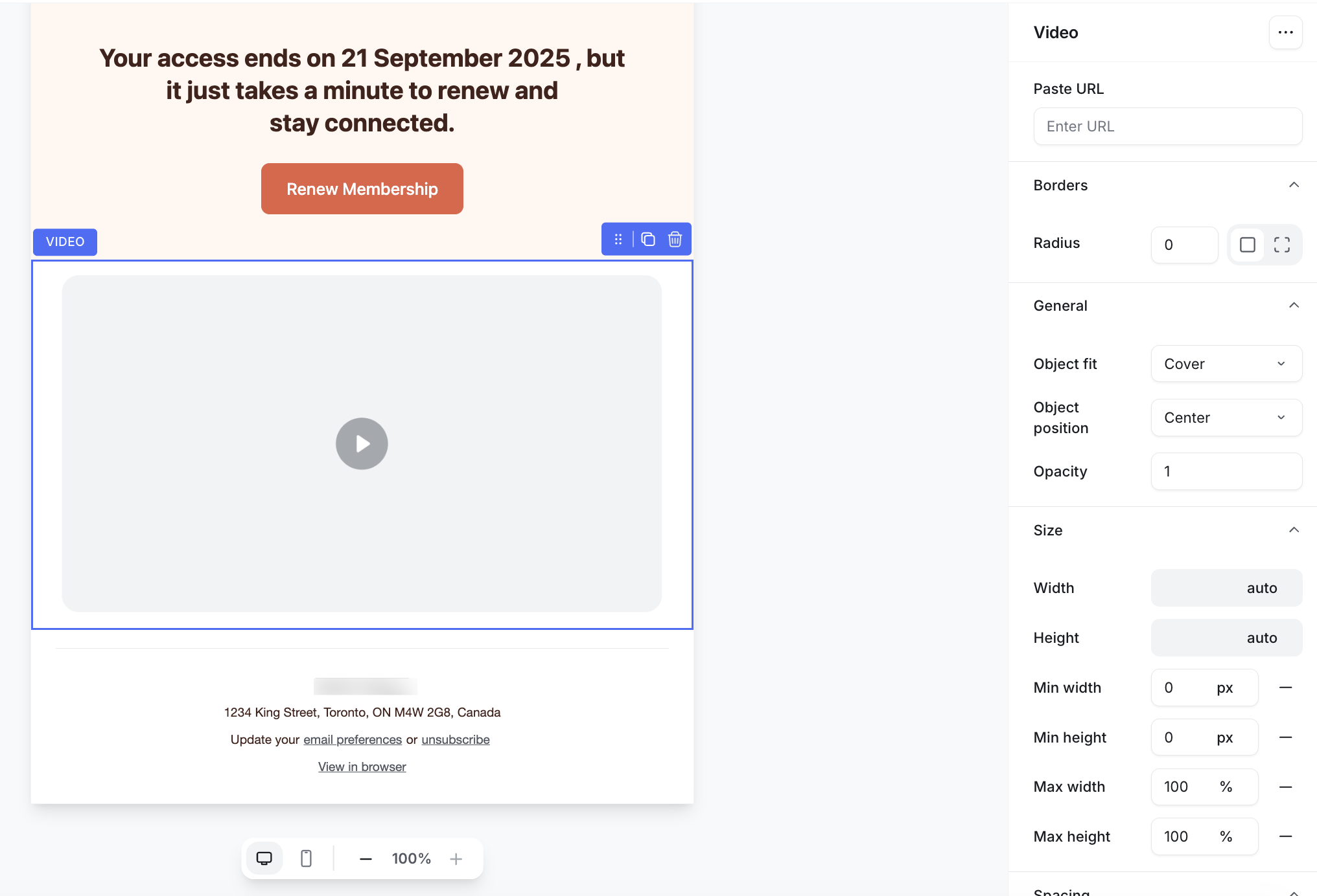
Select the Video element in the right sidebar to configure it.
Paste URL: Add a link to a video hosted on an external platform like YouTube or Vimeo. The builder automatically generates a video preview with a thumbnail and play button. Clicking it opens the video in a new tab.
-
Design options: You can customize the appearance of the video element. This includes corner radius, object fit, sizing, and spacing. These settings help the video fit naturally with the rest of your layout.
Audio
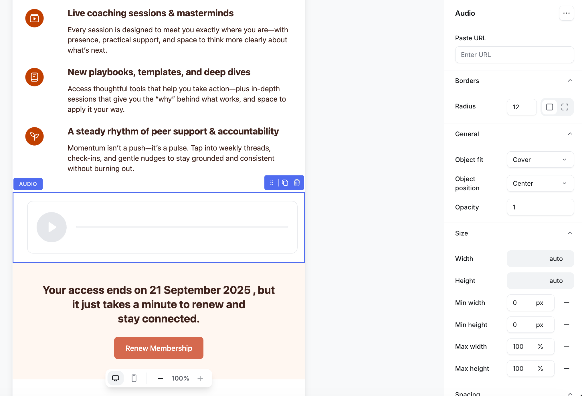
Select the audio element to set it up in the right sidebar.
Paste URL: Add a link to an audio file hosted on an external platform, such as Spotify or SoundCloud. The builder displays a clickable audio preview with a thumbnail in your email. When the recipient clicks the thumbnail or play button, it opens in a new tab.
-
Design options: Fine-tune the appearance of the audio preview, including corner radius, object fit, size, and spacing, to keep it visually consistent with your email design.
Line
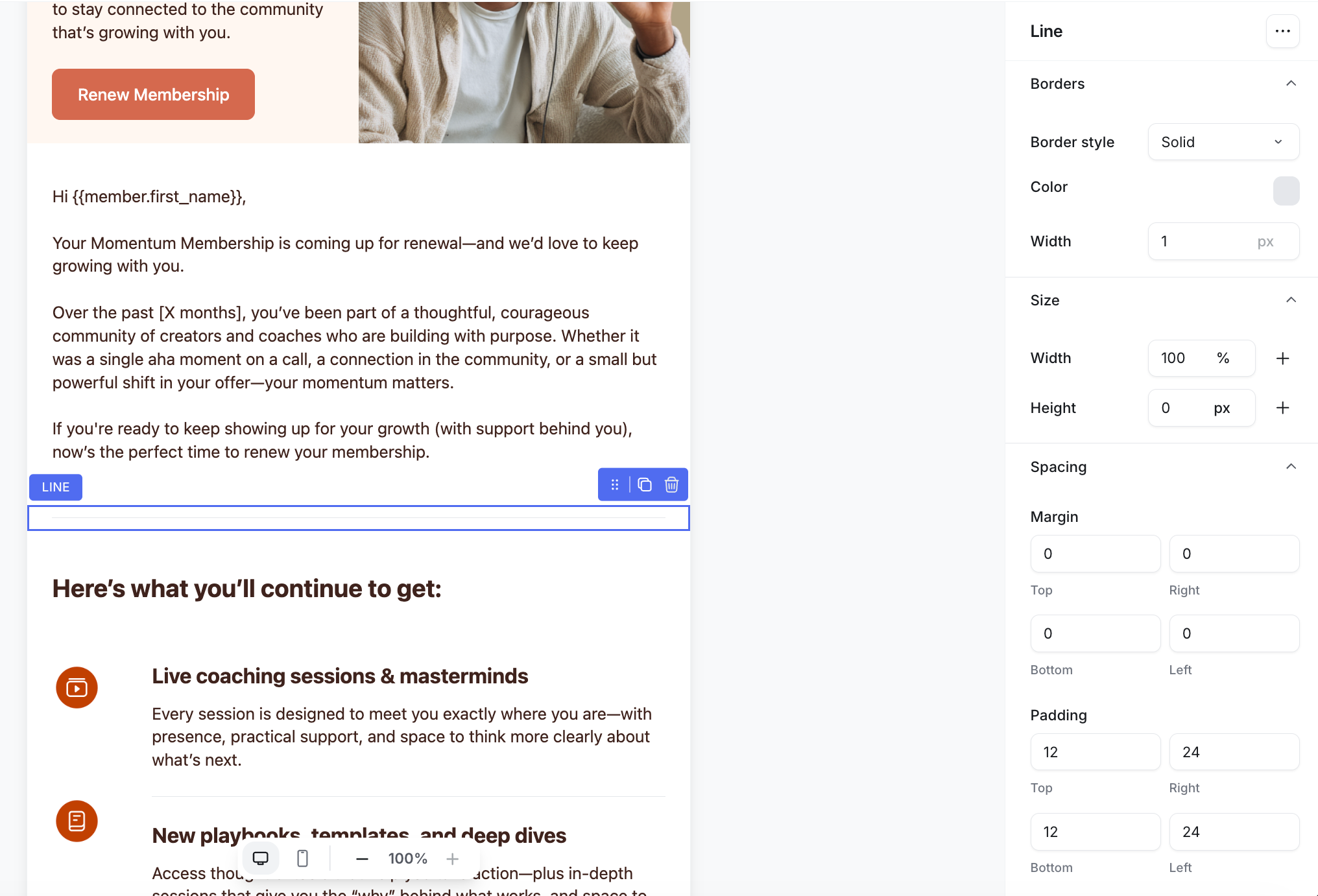
When you select the line element, the right sidebar tab lets you edit the line between various elements to create a section.
List
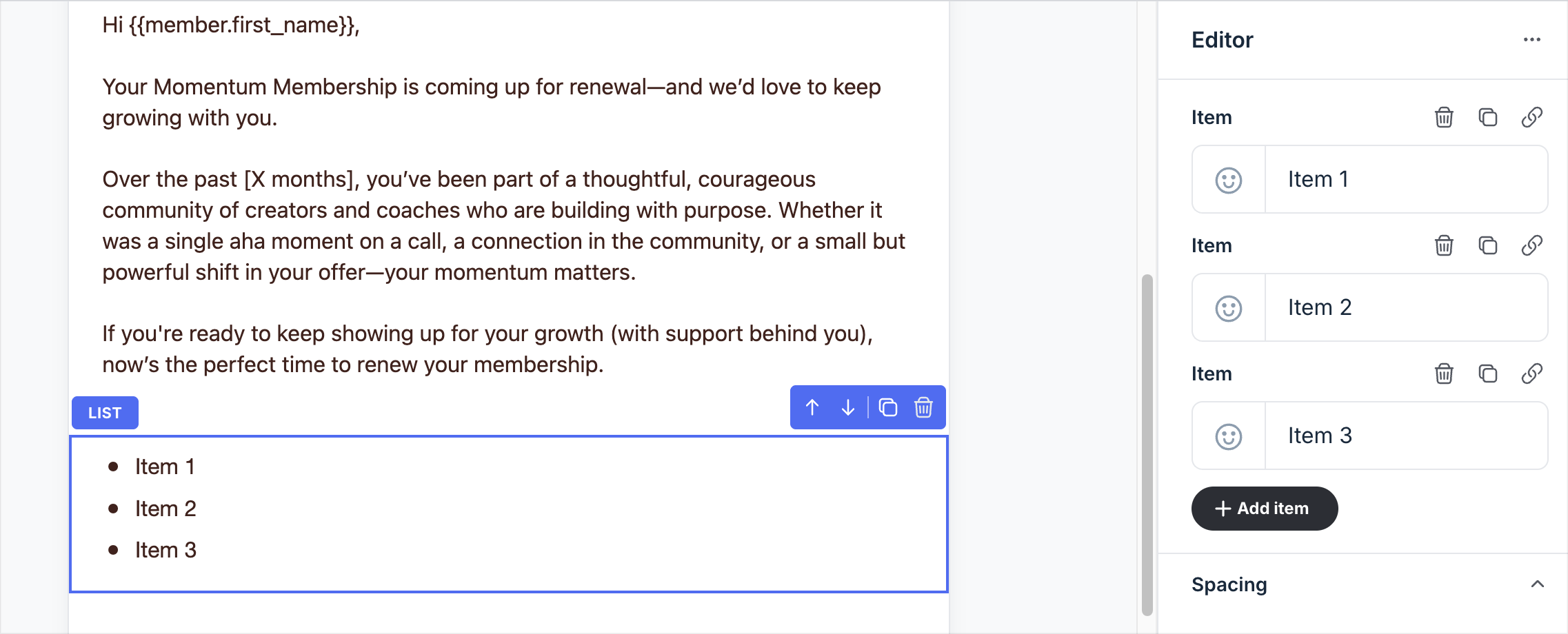
When you select a list element, the right sidebar tab lets you add, edit, and organize your list items.
Add or edit items
Add items: Click Add item at the bottom of your list to create a new one. Each item appears in the same order they were added.
-
Add emojis: You can include an emoji at the start of each list item to add personality or visual context. Click the emoji icon to get started. Then choose from the default emoji list or go to the Custom tab in the emoji picker to upload your own emoji or paste a link to one from the web.
If no emoji is added, it will appear as a bulleted list.
List text: Type your list item text directly in the field. Keep each item short and clear for better readability.
-
Add a link: To turn a list item into a clickable link, click the Link icon at the top right of that item’s field. A new link field will appear below it. Paste your URL there and make sure it includes “https://”.
You can also remove link from any item by clicking the X icon at the top right of the field.
Manage list items
You can manage your list by using the icons that appear at the top right of each item field in the Content tab:
Duplicate item: Creates a copy of the current item and places it at the bottom of the list.
Delete item: Removes the list item.
Customize the design of the elements and blocks
Every element and block offers various design options, allowing you to control its appearance and feel.
To adjust it, select an element or block in the editor, then go to the right sidebar to see the available options.
ℹ️ Note: Elements like buttons and paragraphs shows their design options under the Typography and Spacing sections in the right sidebar.
Let’s take a look at the available design options.
Typography
Use Text settings to control how copy appears for elements such as text, headings, attachments, and lists. The options available will depend on the element.
-
Color: Click the color swatch to change the text color. You can select a color from your theme’s palette or add your own.
To add a custom color, click the ➕ icon under My colors, then use the color picker or enter a specific color code. Colors you add under My colors are saved for this email, so you can reuse them for other elements and blocks.
ℹ️ Note: Changing color here overrides the email theme for this one element.
Text transform: Control capitalization. Options include none (as typed), uppercase, lowercase, or capitalize the first letters of each word.
Font style: Choose the font style, such as normal, italic, or oblique.
Font weight: Set text weight such as normal, medium, semi-bold, or bold.
Font size: Drag the slider or type a size. Small changes (14 → 16 px) can have a big impact on readability.
Line height: Enter a value or use the arrows to increase or decrease spacing between lines.
Text alignment: Pick left, center, right, or justified alignment using the icons.
Text decoration: Apply underline, overline, linethrough, or none.
Spacing
You’ll see four fields for Top, Right, Bottom, and Left.
Padding adds space inside the element’s boundary. For example, increase button padding so the label has more breathing room.
Margin adds space outside the element. For example, add a bottom margin to a heading to separate it from the paragraph below.
Size
Some elements, such as images, videos, and buttons, include size controls.
Width and height: Set to auto, a fixed px value, or a percentage. Use % for responsive layouts (like making an image scale with screen size), and px for precise control (like a small icon).
Min and max width: Define how wide an element can stretch. For example, apply a max width to images so they never exceed your email’s content width.
Min and max height: Define the vertical limits of an element. A min height keeps the element from collapsing, and max keeps it from becoming too tall. For example, apply a maximum height to an image to maintain visual balance in your design.
Buttons
Button elements include extra styling options:
Type: Choose Primary or Secondary. Primary buttons use the theme’s background color by default.
Border width: Control the thickness of the border.
-
Border color: Set a border color for the button. You can select a color from your theme’s palette or add your own.
To add a custom color, click the ➕ icon under My colors, then use the color picker or enter a specific color code. Colors you add under My colors are saved for this email, so you can reuse them for other elements and blocks.
ℹ️ Note: Changing color here overrides the email theme for this one element.
Corner radius
For elements such as buttons and images, you can add a corner radius. Use the respective icon to apply the corner radius option universally or individually to each corner. Then enter the radius in the fields.
General options
For image, video, and audio elements, you have the following additional options:
Object fit: Control how the element fills its container (cover, contain, fill, or none).
Object position: Decide where the element is anchored (center, left, right, top, or bottom).
Opacity: Adjust transparency by entering a percentage.
Background colors
For elements like buttons and blocks, you have the option to choose background colors.
Click the color swatch to change the color.
You can select a color from your theme’s palette or add your own.
-
To add a custom color, click the ➕ icon under My colors, then use the color picker or enter a specific color code. Colors you add under My colors are saved for this email, so you can reuse them for other elements and blocks.
ℹ️ Note: Changing color here overrides the email theme for this one element.
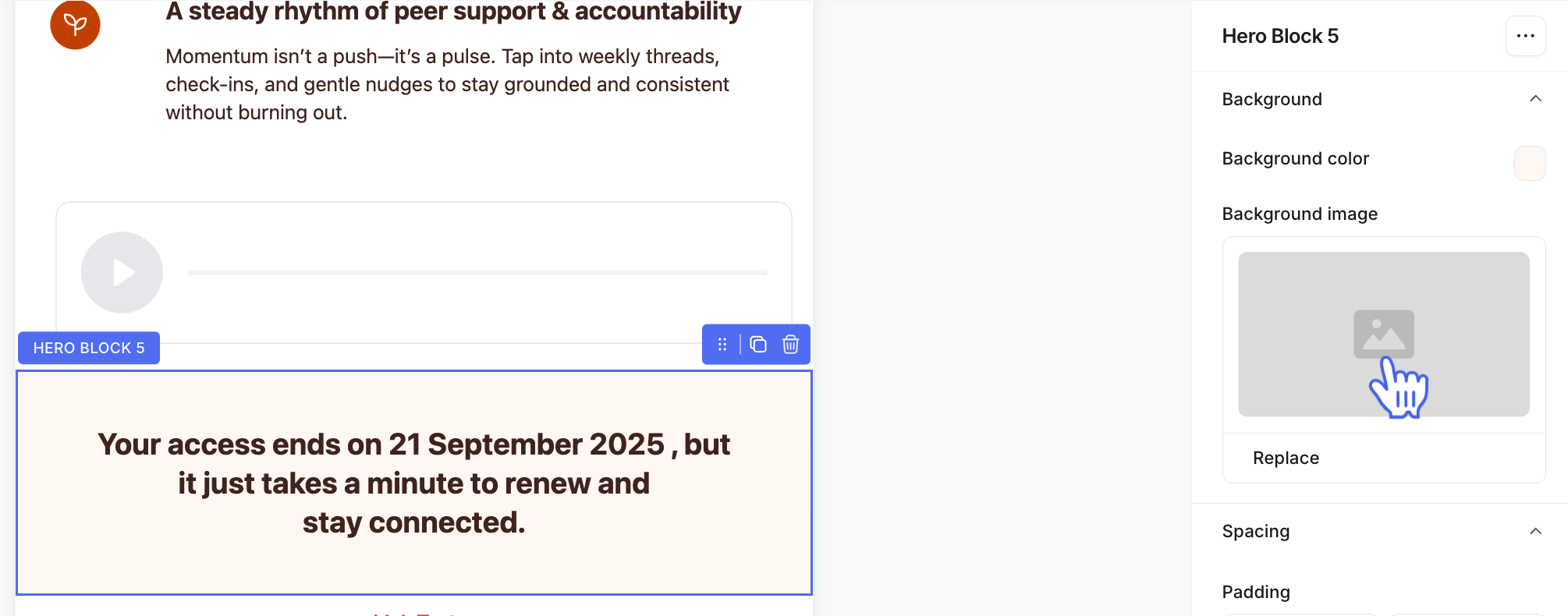
Background image
Some blocks let you add a background image. To set one:
-
Click the placeholder thumbnail to open the image uploader.
-
Choose one of these options:
Upload an image from your computer.
Browse and insert free images from the Unsplash library.
Paste a direct image URL to embed from the web.
Manage elements and blocks
When you select an element or block in the editor, the control bar with management options appears at the top right.
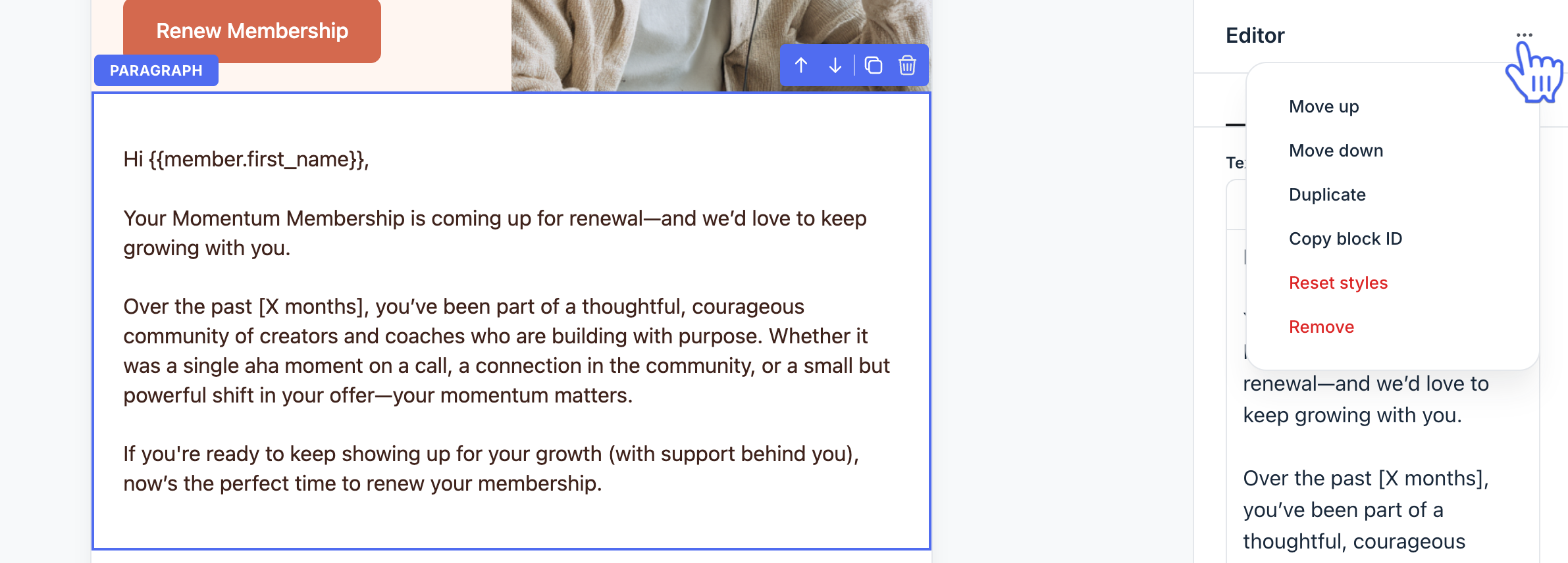
In addition, you can click More actions (three dots) at the top right of the right sidebar to access extra management options. This includes:
Move up or down: Shifts the selected element or block one position higher or lower in the layout. Use the option again to continue moving it multiple places until it reaches the spot you want.
Duplicate: Creates an exact copy of the selected element or block. The duplicate is added directly below the original, making it easy to reuse without rebuilding them.
Copy block ID: Copies the unique block ID to your clipboard. This ID can be useful for advanced use cases.
Reset styles: Restores the element or block to its default design settings. This is helpful if you’ve tried multiple customizations and want a quick way to start fresh without deleting and re-adding the block.
Remove: Deletes the selected element or block from your email.