Customize your community theme
Last updated: August, 2026
With our powerful theme customization feature, admins can fine-tune various aspects of the community theme. In this guide, we will explore how to customize your community theme to make it truly your own.
A well-designed custom theme sets the stage for an improved community experience. It enhances the visual appeal and creates a sense of identity and belonging.
By aligning your community's visual elements, such as logos and colors, with your brand identity, you can reinforce brand consistency. This helps your community stand out. When members find your community visually appealing and easy to navigate, they are more likely to engage and return.
Customize theme
To get started, click the community name or logo in the top-left corner and select Customize theme.
💡 Tip: While you are making changes, you can view them in real-time in the preview area. Also, to check how your community appears in the browser on different devices, such as a desktop, tablet, or mobile, select a Device icon on the bottom tool bar.
You can also customize the theme separately for both light and dark modes. This ensures that your community maintains a consistent and appealing color palette for users, regardless of their preferred mode.
Customize the community theme for a particular mode by selecting the mode you wish to modify and making the following adjustments:
Select default appearance
Add brand color
Choose themes
Copy or paste a custom theme
ℹ️ Note: We use the HEX codes for color customization to ensure precise and consistent color selection.
ℹ️ Note: The option to customize your community theme is exclusive to browsers. Any changes you make will affect how your community appears when viewed on a desktop or mobile browser. The Circle mobile app will maintain its default Circle theme.
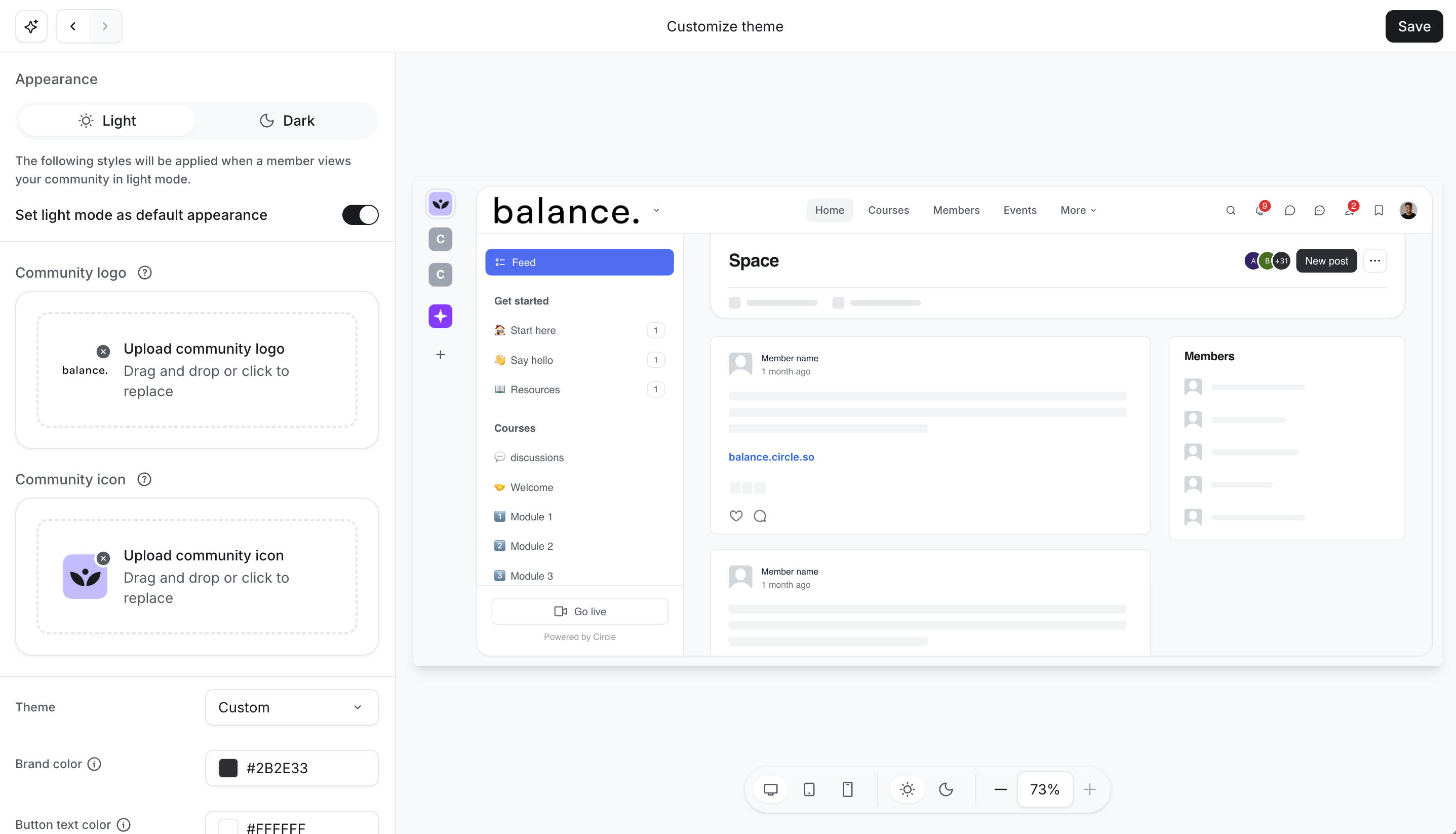
Select default appearance
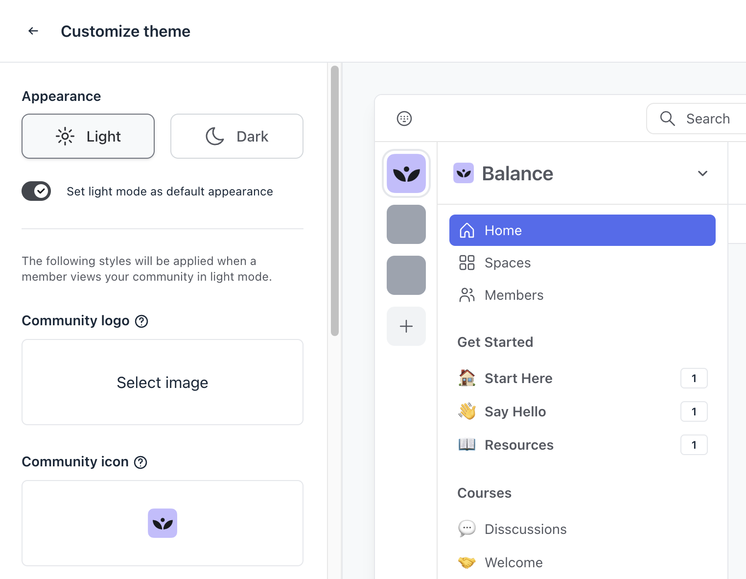
You can set a default appearance for your community in either light or dark mode. To do this, simply click your preferred mode under Appearance and enable the Set light/dark mode as default appearance toggle.
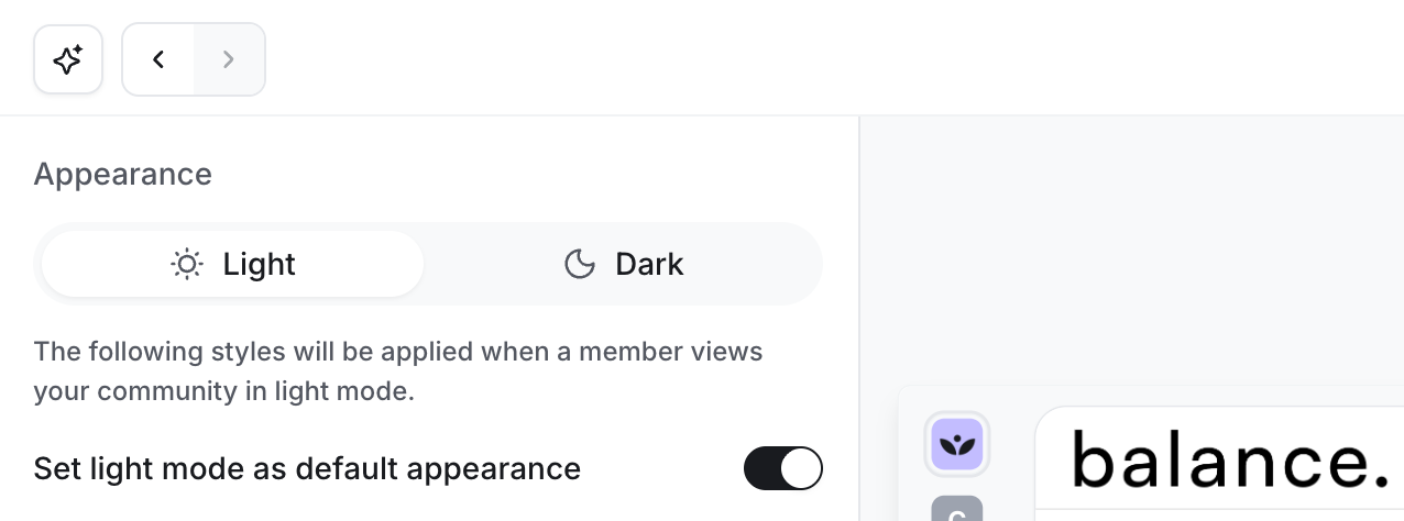
It’s important to note that members can switch between appearance modes at any time. They can do this by clicking their profile picture in the top-right corner and selecting Switch to light/dark mode.
ℹ️ Note: The option to switch between light or dark mode is only available on desktop and mobile browsers. For Circle mobile apps, your iOS or Android operating system’s light or dark mode settings determine the app’s mode. For more information on switching your community appearance, see Switch community appearance between light and dark mode.
Add UI colors
Adjust the color of various community elements such as button text, links, header background and text, sidebar background and text, mention badges, and more.
Choose themes
When it comes to selecting a theme, we provide a variety of pre-designed themes optimized for both light and dark modes.
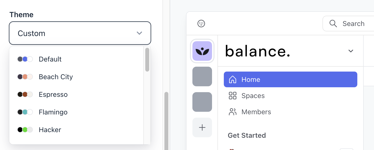
You have three options to tailor the theme to your community's style.
-
Use a pre-designed theme: Click the Themes dropdown menu and select one of our pre-designed themes as is.
-
Customize a pre-designed theme: Click the Themes dropdown menu, select one of the pre-designed themes, and click Create a custom theme to modify its colors to your preference.
-
Custom theme: Click the Themes dropdown menu and select the Custom option to create a theme entirely from scratch.
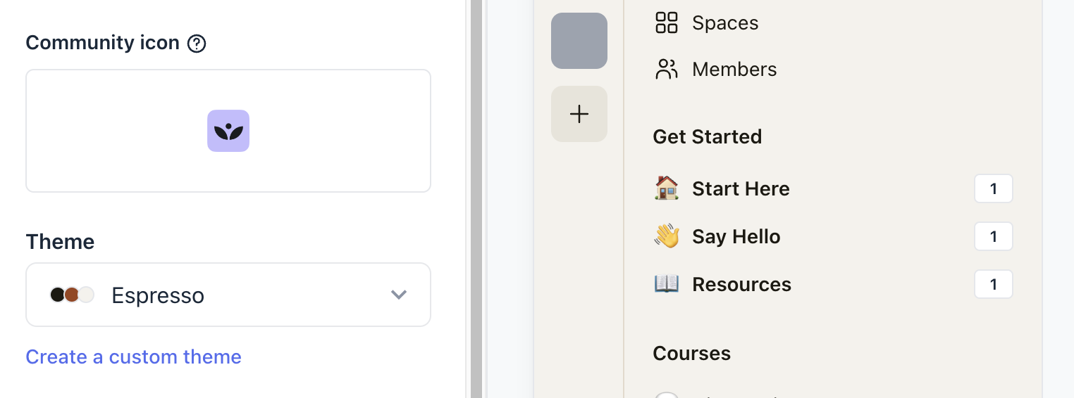
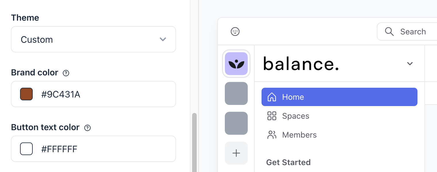
Once you’ve made changes, make sure to save them by clicking Save in the top-right corner.
Copy or paste a custom theme
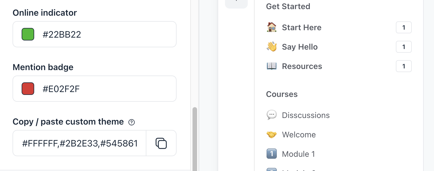
If you’ve chosen to customize the theme colors using one of the options described in the section above, you can copy or paste the HEX codes to share this theme or to import a color theme.
To copy the custom theme colors, click the Copy icon next to the Copy / paste custom theme field. If you would like to import the custom color theme that you may have configured in the past, you can paste the HEX color codes in the same field.
Set community logo
Similar to custom themes, you can add a unique logo and icon for both light and dark modes. This ensures that your community looks great in any mode.
To add a new logo or icon, select the appearance option and click Select image under the logo or icon. Then, you can upload the desired file from your device.
💡 Tip: If you have already uploaded a logo for the light mode in the general settings, it will appear in the light mode configuration.
If you would like to replace the existing logo or icon, simply click them and reupload the file from your device.
📷 Recommended image dimensions for logo: 240x60 px with 4:1 aspect ratio
📷 Recommended image dimensions for icon: 32x32 px
Once you’ve made changes, make sure to save them by clicking Save in the top-right corner.
Customize your theme with Circle AI
Circle AI can build your community's theme for you, so you don't have to tune each color. Describe the look you want in plain words, or share a reference image and ask Circle AI to use its colors. Circle AI turns your input into a complete palette that covers both light and dark modes and can be applied to your community with one click.
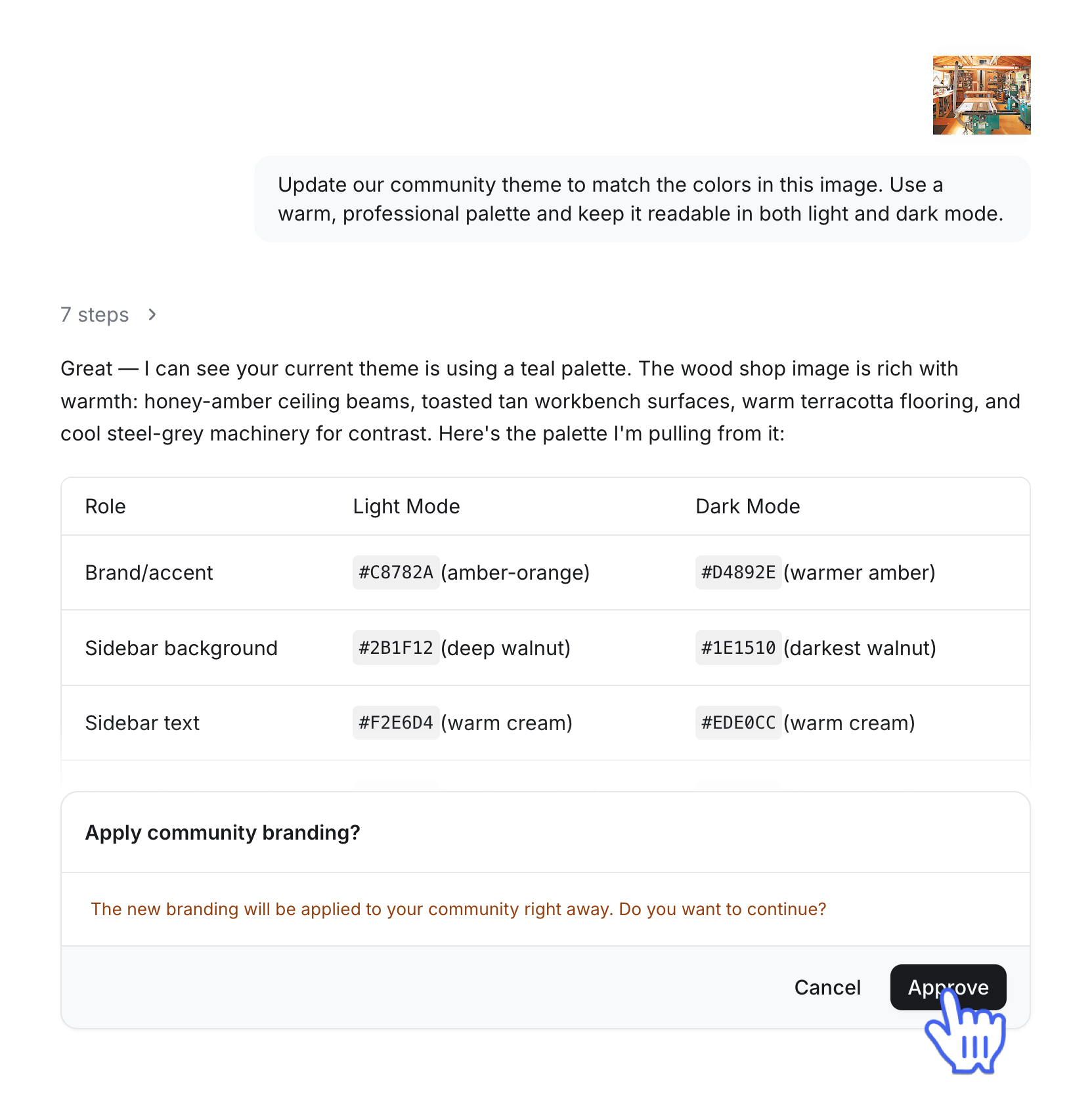
To access Circle AI, click the Circle AI icon in the community switcher or click your community name or logo (or the dropdown icon next to it) and select Circle AI or New Chat.
📚 Learn more about Circle AI.