Create forms
Last updated: October, 2026
Forms are a great way to collect contact information from individuals interested in receiving your marketing emails and automatically add them as contacts, allowing you to effortlessly grow your audience.
About forms
With the new form builder, you can create embeddable forms and customize their layout, field types, styling, and post-submission experience. The builder offers a flexible, visual workspace that allows you to design forms that fit your community’s brand and collect the data you need.
Here’s what you can do with forms:
Collect richer data: Gather information from fields such as name, email, numbers, dropdowns, single-choice and multi-choice options, and short or long text inputs from anyone who submits the form, and they’ll automatically be subscribed to your marketing emails.
Customize the layout and design: Build your form with layout elements such as stacks and customize them with the right sidebar editor to adjust colors, spacing, margins, and padding.
Control the post-submission experience: Show a custom end screen or redirect users to a different page.
Display format: You can choose between two display options. You can embed the form inline within a page's content for a seamless user experience, or use a pop-up for greater visibility.
Share or embed: Forms can be embedded on external websites, landing pages, and even directly in your community posts. You can also share the form with your audience as a standalone page.
Create a new form
To get started:
Click Marketing in the left sidebar, then select Forms.
Click New form in the top-right of the page.
In the Create a new form dialog, provide the internal name. This name is only for your reference and will not be visible to contacts.
Click Create form.
The form editor will now appear, allowing you to customize the form’s content, style, and behaviour.
Understanding the new form builder interface
The new form builder features the same intuitive layout as the page builder, enabling you to create and manage forms with clarity and control. It includes three main panels:
Left sidebar
The left sidebar contains the elements you need to start building your form. This includes:
-
Profile fields: Profile email and profile name
❗️ Important: These fields will create a user profile or update an existing user.
General text inputs: Short answer, long answer and numbers
Structured inputs: Dropdown, single choice and multiple choice
Layout elements: Heading, paragraph and Stack
Action elements: Form button
Preview pane
Similar to page builder, the preview pane allows you to see the form come together in real-time as you build it. Drag and drop elements from the left sidebar into the preview. Select a field in the preview to open its settings in the right-sidebar editor.
The menu bar at the bottom of the preview pane allows you to switch between two editors. Use these tabs to switch between designing your form and customizing the post-submission experience.
Form: Edit the main form and all its elements.
Ending: Edit what members see after submitting the form, see the Configure the post submission behavior section below.
ℹ️ Note: To save and reflect your changes to the form at any time, click Save & publish at the top-right.
Right sidebar
The right sidebar displays the specific settings for the element you’ve selected. Here you can:
Edit field labels or placeholder text.
Configure field-specific behavior such as marking required fields and adding options for choice fields or dropdowns.
-
Adjust design options such as colors, spacing, padding, margins, and typography.
ℹ️ Note: These options will only be available when a stack is selected.
Add elements to your form
Elements are the building blocks of your form. They include text blocks, input fields, and choice-based options that help you collect the necessary information. To add an element to your form, drag and drop it from the left sidebar into the preview.
Here are the available elements:
Profile fields
When submitted, these fields will create a new user or update an existing user’s information.
-
Profile email: The email used to create the contact. All marketing emails will be sent to this email address.
Customize the label and placeholder for the email field in the right sidebar. The default is “Email,” but you can personalize it (e.g., “Your email address”). This field is required by default.
-
Profile name: The user’s name that will be displayed on the profile.
Select the field in the preview pane to customize the field’s label and placeholder in the right sidebar. The default is “Name,” but you can modify it based on your preference (e.g., “Full name”).
By default, the name field is required. However, you can make it an optional field by toggling off Make required in the right sidebar.
-
Custom profile fields: Add existing Custom profile fields such as dropdowns, links or checkboxes to create richer forms.
Customize the default label and placeholder text of any custom profile field. Changes made here will only apply to that form.
General
These fields help you gather richer user information, whether that’s preferences, contact info, or other custom responses.
Short answer: A single-line text field for brief responses. Use this to collect information such as a user’s company name.
Long answer: A multi-line text field for longer or more detailed input. Use this field to collect information such as user bios.
Link: A single-line text field to add collect URLs.
Single choice: This field allows members to pick one option from a list. For example, you can use this field to ask how users hear about your community (social media / friend / search engine).
Multiple choice: Let members select more than one option from a list. For example, what topics are you interested in (events/courses/community updates)?
Dropdown: Use this field to provide a condensed list of options that expands when clicked, for example, countries, industries or affiliated businesses.
Number: Use this field to collect numeric information such as phone numbers or team sizes.
-
Email: A dedicated field for collecting email addresses.
ℹ️ Note: This is separate from Profile email and does not update or create a user account.
Layout
Layout elements help structure your form, making it clear and easy to follow. Use them to break sections apart, add context, or guide members through their submission.
-
Heading: Use this element to add a clear and compelling heading that grabs the user’s attention. For example: “Subscribe to our exclusive newsletter.” The heading element can also be used to divide the form into clear parts.
Once added, you can select a heading element to reveal formatting options in the right sidebar. You can choose between Title (larger font) or Subtitle (smaller font).
Paragraph: Use paragraphs to add supporting text to give context or instructions.
-
Stack: A stack groups elements together and arranges them in a clean layout. For example, you can use a stack to group name, email and phone number into their own section with consistent spacing and a shared background style.
Each stack has its own color, spacing, padding, and styling options, so you can control how the whole group looks and feels without adjusting each element individually.
To edit the stack style, select it in the preview pane.
Actions
Submit button
Add a button that lets members submit the form after they’ve filled in the required fields. Once added you can select the button to customize the text, for example, you can change it to Subscribe or Join the waitlist.
You can only add one button per form. Applying a button disables the option in the left sidebar.
Customize the form’s style
The form builder offers more flexible customization through stack-level controls and overall form styling to ensure it blends well with your brand and site colors. When building your form in the main editor (edit tab), select an element to reveal its options in the right sidebar.
Here, you can customize items such as:
Field labels and placeholder text: Edit the label of your field, and customize the placeholder text to give users an idea of what to enter.
Required field toggle: Mark a field as required to ensure users input their information before being able to submit.
Dropdown and choice options: Add and customize pre-defined options for dropdown and choice-based fields (single or multiple choice).
Button text: Edit the text displayed on a button.
Heading type: Choose between Title (a primary heading to set the topic) or Subtitle (a secondary heading to provide context or clarification) for the heading element.
Stack settings: Select a stack to reveal additional options such as background colors, border styling, alignment, sizing and spacing.
Sharing options for forms
The Share tab provides you with two options for sharing a published form with your audience:
Option 1: Share the link
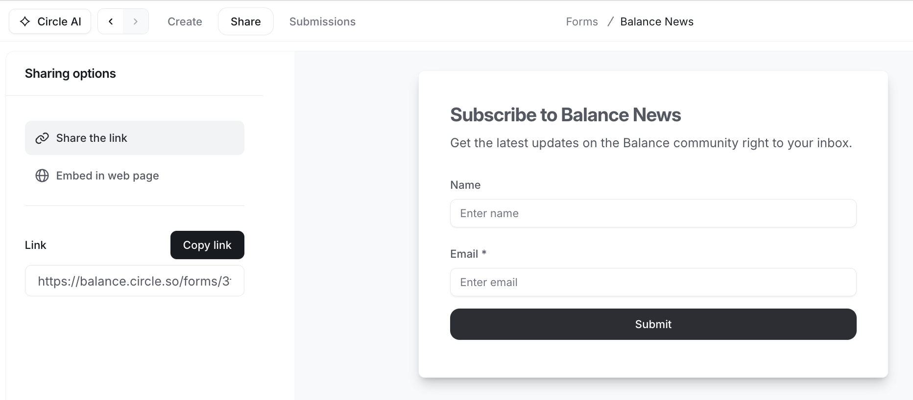
This option gives you a simple, dedicated link you can share anywhere. Ideal for emails, messages, social posts, or within your community.
To get a sharable link, select Share the link from the Sharing options in the left sidebar and click the Copy link button.
Option 2: Embed in web page
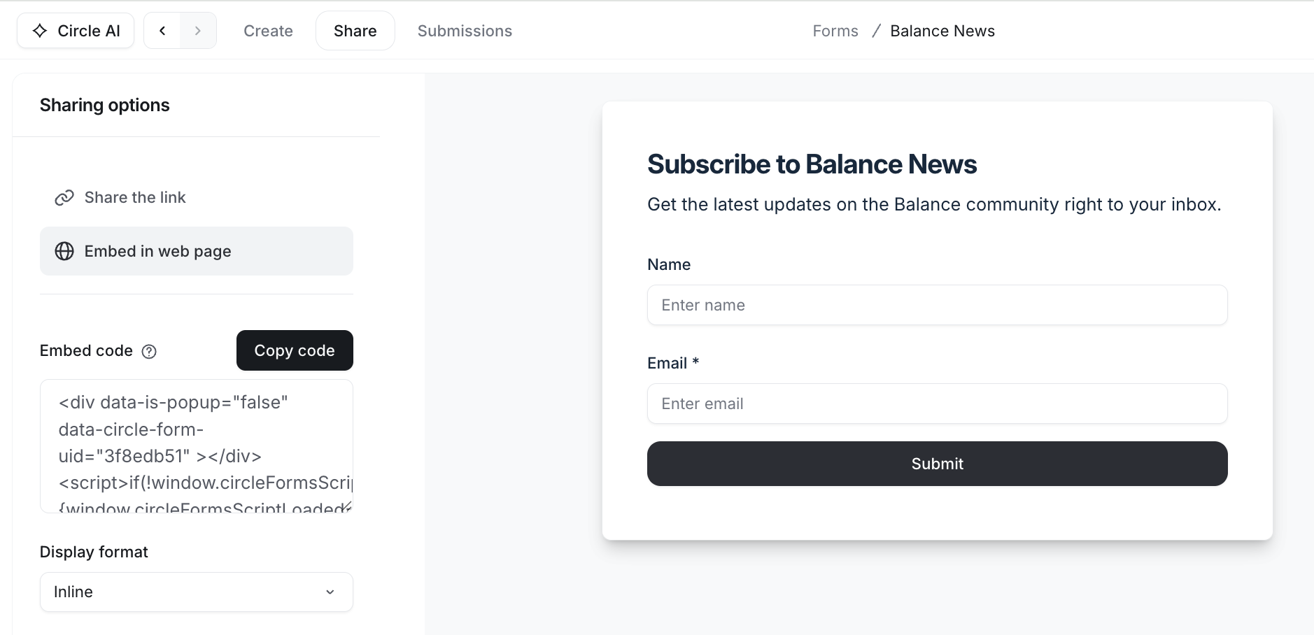
Select this option to get an embed code that can be placed directly in your site or community post. This is ideal for capturing information during browsing flows and maintaining consistency with your site’s design.
To get an embed code, select Embed in web page from the Sharing options in the left sidebar and click the Copy code button.
There are two display format options for embedding the form: inline and pop-up. To select the preferred option, click the Display format dropdown menu and choose your preferred format.
Here’s how they work:
Inline: The form is embedded directly within your website's content and remains fixed as part of the page’s layout, making it ideal for situations where subtle engagement is critical. Paste this code into your website where you want the form to appear.
-
Pop-up: The form appears as a pop-up overlaying your website, which is an ideal option for grabbing users' immediate attention. Paste the embed code at the very end of your website's <body> tag. If you choose this option, you can configure additional options for its display behaviour:
Frequency: Set the number of days to control how often the pop-up appears for users who closed it. This is managed via third-party browser cookies, meaning the pop-up will only reappear if the user visits the site again using the same browser and the site's configuration allows it.
-
Loading delay: Specify the number of seconds to wait after a user arrives on the website, ensuring they have time to explore the site before the pop-up appears.
❗Important: If you change the display format, please make sure to copy the updated embed code and change it on your website.
ℹ️ Note: The frequency configuration only works if the user uses the same browser and hasn’t cleared cookies. If the users use a different browser, open the website in an incognito window, or do not allow third-party cookies, they will see the pop-up again as if visiting the website for the first time. Additionally, “closing” the form includes any action the user takes to dismiss it, such as clicking outside the form, clicking the ✖️ icon on the pop-up, or submitting the form.
💡 Tip: You can also embed the form inside your community post using a custom HTML field in the post settings. When added, the custom HTML will appear at the end of the post body.
Form properties
You can also customize the background, text and button colors of the form for each sharing option.
To do this:
Select either the Link or Embed option.
-
From the properties menu in the right sidebar, update the colors under Design and Button.
Page background color: Choose a background color for the page.
Background color: Choose a background color for the form or button that complements your website.
-
Text color: Set the text color to ensure high readability against the form/button background and alignment with your brand guidelines.
ℹ️ Note: The text color under Design applies to the title, subtitle, and field labels.
You can either enter the desired HEX code in the fields or click the current color to open the palette and choose a color visually.
Configure the post submission behavior
After the user submits the form, you can decide what happens next by selecting one of two actions: An end screen or a redirect.
To configure this, go to the Ending tab at the bottom of the preview pane. In the ending menu, you can choose from one of these options and enter or customize additional details.
End screen
A custom thank you page will appear in place of the form immediately after the user submits it. This is a great way to acknowledge the action, and make them feel appreciated for showing interest and submitting the form.
When you choose this option, you can customize the following:
Title: This is where you can add a clear, concise statement that acknowledges the submission.
Body text: Use this field to provide additional information. You can only add plain text and paste any emoji if you’d like. No other formatting options are available for this field.
Redirect
A redirect allows you to send users to an external URL after submitting the form. This option is ideal if you want to direct users to a specific page rather than a thank-you page. The redirect could be your promotional landing page, marketing site, or your community.
When you choose this option, a URL field will appear. Enter a valid URL to redirect users in the field.