Create and manage custom screens and navigation for branded apps
Last updated: October, 2026
Create engaging, tailored experiences for your branded apps using the powerful visual custom app builder.
Get to know the custom app builder
The custom app builder empowers you to design and manage navigation, custom screens, and onboarding carousels for your branded apps.
With the custom app builder, you can:
Personalize with ease: Build your app vision using an intuitive, user-friendly, no-code interface that does not require technical expertise. Conversely, if you are an advanced user, you can utilize a custom HTML template to unlock many possibilities for creating advanced pages or components using custom screens.
Update instantly: Make updates without waiting for app store approvals, keeping your app fresh and relevant.
Boost engagement: Deliver personalized screens and interactive libraries to captivate your audience.
Availability
The custom app builder is available to communities that purchase a branded app with their Circle Plus plan.
If you’re on the Circle Plus plan and would like to purchase a branded app for your community, please contact your dedicated Success Manager.
Navigating to the custom app builder
To access the custom app builder and customize navigation:
Click Branded app in the left sidebar, then select Branded app.
On the Custom app builder page, click Manage screens.
Understanding how publishing works
You can publish navigation updates to your branded app in two ways, depending on whether you want to test them privately or share them with all users instantly. You can do this using the Admin preview toggle:
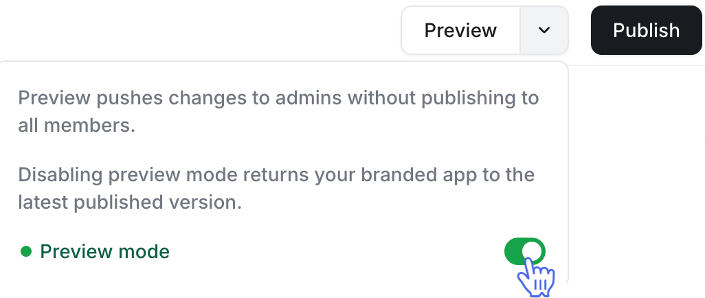
Admin preview mode enabled
When Preview mode is toggled on, changes are applied only to admin accounts for testing purposes. This allows you to review updates privately before making them available to all users.
How it works:
-
Enable the Preview mode toggle in the Custom app builder section.
Make your desired changes (e.g., navigation or custom screen updates) in the app builder.
Click the Preview button in the top-right corner to save and view the changes in your admin account.
Use your admin account to check the branded app on your mobile to ensure that the updates look correct and function as intended. If your app was already open, restart it to reflect the changes.
Admin preview disabled
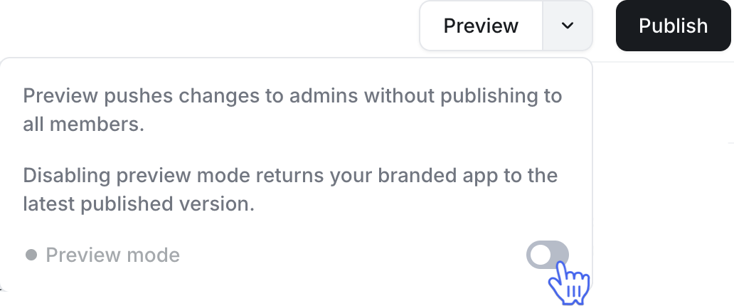
When Admin preview is toggled off, changes are published directly to all users of your app.
How it works:
-
Disable the Preview mode toggle in the Custom app builder section.
Make your desired changes in the builder.
Click the Publish button in the top right corner to make the changes live for all users.
Create custom screens
Custom screens appear as navigable tabs in your app, allowing members to switch between them using the top navigation bar. You can add up to 15 custom screens to your branded apps.
This is a great way to showcase:
Content libraries.
Product or service directories (hosted within or outside the app).
Custom pages with interactive content using embeds or HTML elements.
To get started:
-
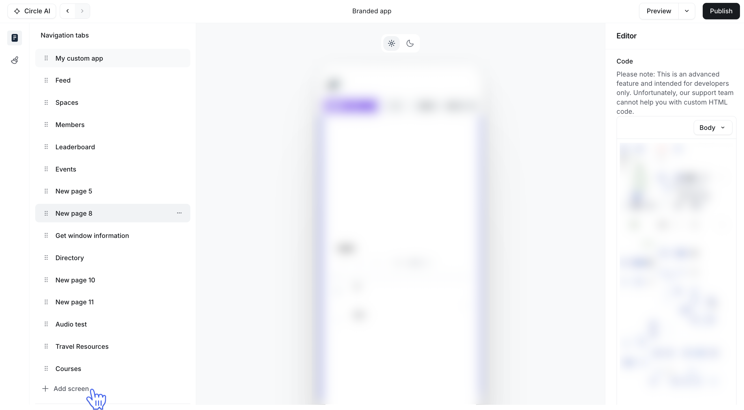
Go to the Navigation tabs section in the left sidebar and click Add screen.
-
Choose a template from the available options:
Directory
Custom HTML
Embed
Agents
Audio
Video
Calendar
Custom blocks: Ideal for displaying an overview of your community, your team, etc., with a mix of content blocks like images, text, and buttons to build a simple yet flexible screen.
Click Use this template to begin building your screen.
ℹ️ Note: If the available templates don’t fit the screen you want to build, click Suggest a template. This opens a form where you can share details about the kind of page you’re trying to create.
Understanding the app builder interface
The custom app builder is organized into three key areas for a seamless editing experience:
Left sidebar (Manage screens): Allows you to create and manage onboarding screens and navigation tabs, including hidden ones.
Center preview pane: Shows a live preview of the selected screen. At the top of the preview, you can also toggle between light and dark modes. This helps you view your changes in real time before you save them.
Right sidebar (Editor): Allows you to edit screen content, including images, titles, URL, and more.
In the following sections, we will go over how you can create screens using these templates.
Directory
The directory template displays large thumbnails with titles, descriptions, and clickable URLs, perfect for showcasing product lineups, content categories, events, or courses.
By default, the template includes three images, but you can add more by duplicating existing ones.
Customize images
To customize an image, in the center preview pane, click the image placeholder. This highlights the image for customization.
Use the right sidebar to configure the following:
-
Image: Click Replace to choose a new image. You’ll see three tabs:
Upload: Upload an image from your device (recommended size: 840 x 300 px).
Unsplash: Browse and select a high-quality image from the Unsplash library.
Embed link: Insert an image using a direct URL.
Text color: Adjust the color of the text overlay (e.g., title and description text) to ensure readability against the image. Choose a color that contrasts well with the image for a polished look.
Alt text: Add descriptive alt text to make the image accessible to screen readers.
Title: Enter a concise title for the image. This can reinforce the screen’s message.
Description: Provide a brief description to accompany the image. This could elaborate on the title or highlight the screen’s purpose.
-
URL: Link the image to a specific destination by entering a URL. You can choose from:
URL: Select the URL option and enter a link to an event, course, space, or other area within your app’s community or an external webpage.
Hidden screens: Select the Not in nav option to link to a screen that’s hidden from the app’s main navigation bar, allowing for a customized user flow.
Reorder images
To rearrange the sequence of images on the screen:
Select the image from the preview pane.
Use the Up or Down arrows located at the top right of the image.
This allows you to easily move the image to your preferred position within the list.
Duplicate an image
To create a copy of an image with its configuration:
Select the image from the preview pane.
Click the Duplicate icon in the top-right corner of the selected image.
The duplicated image will appear right below the original, ready for further customization or use.
Delete an image
To permanently remove an image from the screen:
Select it from the preview pane.
Click the Delete icon at the top right of the image.
This action cannot be undone, so ensure you no longer need the image before deleting it.
Custom HTML
The custom HTML template lets you build a custom screen in your branded app using your own HTML code, offering flexibility to create unique, interactive pages.
To add the code:
In the right sidebar’s code field, use the dropdown in the field header to choose Head or Body.
Then enter your HTML code in the field.
❗Important: This is an advanced feature intended for users with technical expertise. Any errors or inaccuracies in your code may break the custom screen or app navigation. Therefore, exercise caution and ensure your custom HTML code is error-free. Unfortunately, our support team will not be able to provide assistance with troubleshooting or code-related issues in case of any complications.
Tips for custom HTML screens
Test the screen on your mobile device first before publishing it to everyone. Utilize the Admin preview toggle as described in this article earlier to reflect the new screen in your admin account to test changes.
Design with mobile users in mind. For long pages, ensure intuitive scrolling and avoid overwhelming content.
Include clear buttons or links to guide users on the screen.
Minimize large images or heavy code to maintain fast load times and smooth performance.
The possibilities are endless with a custom HTML screen. For example, you can create:
A sales page with embedded video, testimonials, and CTA buttons to upsell your members.
A resource library organized by topic or membership tier.
A video library of embeds with your own custom layout.
A launch page for a new product or time-sensitive campaign.
Embed
The embed template lets you integrate media from over 1,900 providers powered by Iframely, including:
Audio & video platforms: YouTube, Vimeo, Spotify, Bandcamp, Twitch.
Social media: Instagram, Twitter (X), Facebook, Pinterest.
Documents: Scribd, Google Docs, Dropbox, SlideShare.
Interactive tools: Google Maps, Typeform, Calendly, Google Calendar.
For a comprehensive list of supported providers, please visit iframely.com/domains.
In the right sidebar, simply enter the URL of the content you want to embed, which is typically the “share” link from the platform hosting your media.
❗Important: Inserting an embed code directly into the embed URL field won’t work. If you want to use custom HTML code to embed media, use the custom HTML screen template instead.
Agents
The agents template lets you add your AI agents to the screen. In the right sidebar, use the dropdown in the field header to choose from your existing AI agents. To remove an agent, click the X next to its name.
Launch your members directly into an agent chat from Home. This helps people discover the value of your agents the moment they open the app.
You can also choose to place the agents template in another tab on Home instead of the main screen.
💡Conversation history remains available in the Agent section of the Messages tab.
Audio
The audio template lets you add audio content to your Home tab by uploading files directly from your device.
To customize the image for the audio, in the center preview pane, click the image placeholder. This highlights the image for customization.
Use the right sidebar to configure the following:
-
Image: Click Replace to choose a new image. You’ll see three tabs:
Upload: Upload an image from your device (recommended size: 840 x 300 px).
Unsplash: Browse and select a high-quality image from the Unsplash library.
Embed link: Insert an image using a direct URL.
Alt text: Add descriptive alt text to make the image accessible to screen readers.
Borders: Choose between a square and round border for the image. You can also set a corner radius, applying it universally or individually to each corner, by entering the radius in the fields provided.
Fill: Choose the background color behind the image. To add a custom color, click the ➕ icon under My colors, then use the color picker or enter a specific color code.
Text color: Adjust the color of the text overlay (e.g., title and description text) to ensure readability against the image. Choose a color that contrasts well with the image for a polished look.
Spacing: Choose the top & bottom and left & right spacing between the image and its border.
Reorder image
To rearrange the sequence of images on the screen:
Select the image from the preview pane.
Use the Up or Down arrows located at the top right of the image.
This allows you to easily move the image to your preferred position within the list.
Duplicate an image
To create a copy of an image with its configuration:
Select the image from the preview pane.
Click the Duplicate icon in the top-right corner of the selected image.
The duplicated image will appear right below the original, ready for further customization or use.
Delete an image
To permanently remove an image from the screen:
Select it from the preview pane.
Click the Delete icon at the top right of the image.
This action cannot be undone, so ensure you no longer need the image before deleting it.
Video
You can use the Video template to add engaging video content directly to your app screens by pasting a YouTube or Vimeo URL, embedding videos seamlessly in your community app.
To customize the video, in the center preview pane, click the image placeholder. This highlights the video for customization.
Use the right sidebar to configure the following:
-
Video file: Upload the video file from your device.
Click Replace to replace the video file.
Click the Delete icon (🗑️) to remove the video file.
-
Custom cover image: Toggle this on to add a custom cover image for the video file.
Click Replace to replace the cover image.
Click the Delete icon (🗑️) to remove the cover image.
Sizing: Choose the video file's dimensions, including width, height, min width, min height, max width, and max height.
Spacing: Choose spacing options for the video file's margins and padding.
Calendar
Add a calendar booking page to your Home tab so members can schedule time with you without leaving the app.
To set it up, use the URL field in the right sidebar to add your booking link.
Custom blocks
The Custom blocks template lets you build flexible screens using a mix of content blocks, such as text, images, and buttons. It's great for creating simple landing pages, announcements, or resource hubs without needing to code.
You can use the blocks already in the template, customize them, duplicate them, or rearrange the layout as needed.
Customize blocks
To customize a block and its elements, click the block in the center preview pane. Use the options in the right sidebar to adjust it. Depending on the block type, you’ll see:
Content: Add or replace images, alt text for images, title and description texts, URLs, and more.
Design: Customize how the block looks. Change text or background colors, adjust spacing (margins and padding), tweak alignment, and set corner radius for a softer or sharper design.
This gives you control over both the content and the layout, so your screen looks how you want.
Reorder blocks
You can move blocks up or down to adjust the order they appear on the screen. To do so:
Select the block from the preview pane.
Click the Up or Down arrow at the top right of the block.
This helps you fine-tune the flow of the page without needing to rebuild anything.
Duplicate a block
To reuse a layout or element without starting from scratch:
Select the block in the preview pane.
Click the Duplicate icon (two overlapping squares) in the top right corner.
A copy of the block will appear right below the original. From there, you can tweak the content or style as needed.
Delete a block
To remove a block:
Click the block in the preview pane.
Select the Delete icon (trash can) at the top right.
This action cannot be undone, so ensure you no longer need the block before deleting it.
Manage screen settings
To access various screen settings, hover over the tab in the left sidebar and click More action (three dots).
Page name
You can rename the screen to better match its content or purpose. To do so, replace the current name with your desired one and press Enter. This name will appear on the app’s navigation tab.
Visibility
You can control which tabs are visible on your app’s navigation bar by hiding less essential ones.
To hide it from the app’s navigation bar, click the visibility dropdown menu and select Hide from navigation.
Once hidden, the tab will be moved to the Screens not in nav section in the left sidebar. You can edit it anytime or bring it back by choosing the In navigation option from the same menu.
Access control
Control who can see each screen to make sure the right content reaches the right members.
You have two options:
Members
All logged-in members can access the screen. Use this for content that should be available to all members.
Access groups
Limit the screen to specific groups. This is useful for gated content, like premium resources or onboarding flows.
To select an access group, click the dropdown menu and select from the list. You can select more than one group in the list.
Once set, only members of the access group will be able to see and access this screen from the top navigation. For others, it will remain hidden.
Set up navigation tab order
To draw attention to the most important tabs in your app’s navigation bar, consider rearranging their order and placing the crucial ones at the top. The tabs will be displayed from left to right on the mobile app's top navigation bar.
Click and hold the Reorder icon next to the tab in the left sidebar, then drag and drop it to your preferred position.
Delete custom screens
Permanently remove custom screens from your app’s navigation when they’re no longer needed. Note that you won’t be able to delete system tabs such as feed, events, courses, members, and spaces. If you don’t want to show a system tab, you can hide it from the navigation bar instead.
To remove a screen, click More actions (three dots) next to the tab in the left sidebar. In the top-right corner of the screen settings, click More actions (three dots) and select Delete.